目录
WPF项目中集成ScottPlot:从零到一画出你的第一条数据曲线
说实话,咱们做WPF开发的,十有八九都遇到过这样的需求:老板突然让你在界面上展示个实时数据曲线,或者搞个设备监控图表啥的。这时候你可能会想到用微软自家的Chart控件,结果发现性能差、样式丑、自定义起来贼麻烦。我之前做过一个工业监控项目,用Chart控件渲染10万个数据点,直接卡成PPT,帧率从60fps掉到个位数。
后来我发现了ScottPlot这个开源图表库,真是相见恨晚。它专门针对大数据量优化,同样10万个点,渲染只需要几十毫秒,而且API设计得特别人性化,三五行代码就能搞定一个漂亮的图表。
ScottPlot这个组件最让我受不了的就是版本变化改的太多了。这块得注意。
读完这篇文章,你能收获这些实实在在的技能:
- 15分钟完成ScottPlot环境搭建,避开常见的版本兼容性陷阱
- 掌握3种典型场景的图表实现,直接复制粘贴就能用
- 学会性能优化的核心技巧,轻松应对百万级数据展示
💡 为啥非要用ScottPlot?Chart控件它不香吗?
痛点一:Chart控件真的扛不住大数据量
我先说个真实数据对比。去年给一家制造业客户做数据采集系统,传感器每秒采集100个点,一分钟就是6000个点。用微软Chart控件实时刷新图表,CPU占用直接飙到40%,界面操作明显卡顿。换成ScottPlot之后,CPU占用降到5%以内,而且鼠标缩放、拖动都丝般顺滑。
这背后的原因其实很简单:Chart控件是基于WinForms时代的设计思路,每次更新都要重新计算布局和渲染整个控件树。而ScottPlot底层用的是高性能的Bitmap渲染,配合智能的缓存机制,只重绘变化的部分。
痛点二:样式自定义简直是噩梦
Chart控件的样式系统复杂得离谱,想改个坐标轴颜色都得翻半天文档。我记得有次想把网格线改成虚线,找了一个小时资料,最后发现还得自己写Custom绘制逻辑。
ScottPlot就友好多了,基本上所有样式都能通过属性直接设置:
csharp// Chart控件:一堆嵌套属性,头都大了
chart1.ChartAreas[0].AxisX.MajorGrid.LineColor = Color.Gray;
chart1.ChartAreas[0]. AxisX.MajorGrid.LineDashStyle = ChartDashStyle.Dash;

// ScottPlot:简洁明了,一看就懂
wpfPlot1.Plot.Grid(color: System.Drawing.Color.Gray, lineStyle: LineStyle.Dash);
痛点三:跨平台支持差
Chart控件是Windows专属的,如果你们公司后面要做跨平台方案,这部分代码基本得重写。ScottPlot支持WPF、WinForms、Avalonia甚至控制台应用,代码基本不用改。
🔧 环境搭建:十分钟配置完战斗环境
第一步:确认你的开发环境
这是我踩过坑之后总结的配置清单,照着来基本不会出问题:
| 组件 | 推荐版本 | 最低要求 |
|---|---|---|
| Visual Studio | 2022(17.4+) | 2019(16.8+) |
| .NET版本 | . NET 6.0 / .NET 7.0 | . NET Framework 4.6.2 |
| ScottPlot. WPF | 5.0+ | 5.0以一版本api区别有点大 |
注意事项:如果你用的是. NET Framework项目,强烈建议升级到4.7.2以上,不然某些依赖包会出现莫名其妙的加载失败。
第二步:安装NuGet包
打开Visual Studio的包管理器控制台(工具 NuGet包管理器 → 程序包管理器控制台),输入以下命令:
powershellInstall-Package ScottPlot.WPF
或者你习惯用图形界面,右键项目 → 管理NuGet程序包 → 浏览,搜索"ScottPlot. WPF",点安装就行。
踩坑预警:有些同学习惯直接装ScottPlot包,这个是核心库,WPF项目必须装ScottPlot.WPF才能用控件。我之前就因为这个浪费了半小时,一直报"找不到命名空间"的错误。
第三步:验证安装是否成功
安装完成后,打开MainWindow.xaml,在顶部添加命名空间引用:
xml<Window x:Class="AppScottPlotWfp.MainWindow"
        xmlns="http://schemas.microsoft.com/winfx/2006/xaml/presentation"
        xmlns:x="http://schemas.microsoft.com/winfx/2006/xaml"
        xmlns:d="http://schemas.microsoft.com/expression/blend/2008"
        xmlns:mc="http://schemas.openxmlformats.org/markup-compatibility/2006"
        xmlns:local="clr-namespace:AppScottPlotWfp"
        mc:Ignorable="d"
        xmlns:ScottPlot="clr-namespace:ScottPlot.WPF;assembly=ScottPlot.WPF"
        Title="MainWindow" Height="450" Width="800">
    <Grid>
        <ScottPlot:WpfPlot Name="wpfPlot1" />
    </Grid>
</Window>
按F5运行,如果看到一个灰色的空白图表区域,恭喜你,环境搭建成功!
🚀 第一个图表:十行代码搞定折线图
基础版:最简单的数据可视化
咱们先来个最简单的例子,画一条正弦曲线。打开MainWindow.xaml. cs,在构造函数里加上这段代码:
csharpusing System.Text;
using System.Windows;
using System.Windows.Controls;
using System.Windows.Data;
using System.Windows.Documents;
using System.Windows.Input;
using System.Windows.Media;
using System.Windows.Media.Imaging;
using System.Windows.Navigation;
using System.Windows.Shapes;

namespace AppScottPlotWfp
{
    /// <summary>
    /// Interaction logic for MainWindow.xaml
    /// </summary>
    public partial class MainWindow : Window
    {
        public MainWindow()
        {
            InitializeComponent();

            var fontName = "Microsoft YaHei";
            var plot = wpfPlot1.Plot;
            plot.Font.Set(fontName); //这个控制了Title的字体,标签和刻度标签需要单独设置字体
            plot.Title("我的第一个ScottPlot图表"); //这个还不如Title加一个参数来设置字体呢

            plot.Axes.Bottom.Label.Text = "时间 (秒)";
            plot.Axes.Bottom.Label.FontName = fontName;
            plot.Axes.Bottom.TickLabelStyle.FontName = fontName;

            plot.Axes.Left.Label.Text = "幅值";
            plot.Axes.Left.Label.FontName = fontName;
            plot.Axes.Left.TickLabelStyle.FontName = fontName;

            double[] xData = new double[50];
            double[] yData = new double[50];
            for (int i = 0; i < 50; i++)
            {
                xData[i] = i * 0.1;
                yData[i] = Math.Sin(xData[i]);
            }

            plot.Add.Scatter(xData, yData);
            wpfPlot1.Refresh();
        }
    }
}
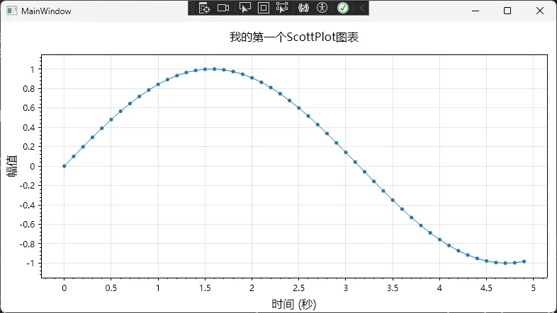 运行一下,你会看到一条漂亮的蓝色正弦曲线。这段代码虽然简单,但包含了ScottPlot的核心使用逻辑:
- 准备数据数组:X轴和Y轴分别用double数组存储
- 调用AddScatter:这是最常用的方法,用于绘制散点图或折线图
- 设置样式:通过Plot对象的属性方法配置标签和标题
- 刷新渲染:Refresh()触发界面更新
进阶版:多条曲线对比
实际项目中,我们经常需要在同一个图表里对比多组数据。比如监控三个传感器的温度变化,代码也就多几行:
csharpusing ScottPlot;
using System;
using System.Collections.Generic;
using System.Linq;
using System.Text;
using System.Threading.Tasks;
using System.Windows;
using System.Windows.Controls;
using System.Windows.Data;
using System.Windows.Documents;
using System.Windows.Input;
using System.Windows.Media;
using System.Windows.Media.Imaging;
using System.Windows.Shapes;

namespace AppScottPlotWfp
{
    /// <summary>
    /// Interaction logic for Window1.xaml
    /// </summary>
    public partial class Window1 : Window
    {
        public Window1()
        {
            InitializeComponent();

            // 生成时间轴(共享X轴)
            double[] timePoints = Enumerable.Range(0, 100)
                                            .Select(i => i * 0.1)
                                            .ToArray();

            // 模拟三个传感器的数据
            double[] sensor1 = timePoints.Select(t => 20 + 5 * Math.Sin(t)).ToArray();
            double[] sensor2 = timePoints.Select(t => 22 + 3 * Math.Cos(t * 1.2)).ToArray();
            double[] sensor3 = timePoints.Select(t => 21 + 4 * Math.Sin(t * 0.8 + 1)).ToArray();

            // 添加三条曲线,设置不同颜色和标签
            var plot1 = wpfPlot1.Plot.Add.Scatter(timePoints,sensor1);
            plot1.LineWidth = 2;
            plot1.LegendText = "传感器1";

            var plot2 = wpfPlot1.Plot.Add.Scatter(timePoints, sensor2);
            plot2.LineWidth = 2;
            plot2.LegendText = "传感器2";

            var plot3 = wpfPlot1.Plot.Add.Scatter(timePoints, sensor3);
            plot3.LineWidth = 2;
            plot3.LegendText = "传感器3";

            wpfPlot1.Plot.Legend.FontName= "Microsoft YaHei"; //这些写法吧,一言难尽
            wpfPlot1.Plot.ShowLegend(Alignment.LowerLeft);

            wpfPlot1.Plot.Axes.Bottom.Label.FontName = "Microsoft YaHei";
            wpfPlot1.Plot.XLabel("时间 (秒)");

            wpfPlot1.Plot.Axes.Left.Label.FontName = "Microsoft YaHei";
            wpfPlot1.Plot.YLabel("温度 (℃)");

            wpfPlot1.Plot.Font.Set("Microsoft YaHei");
            wpfPlot1.Plot.Title("多传感器温度监控");

            wpfPlot1.Refresh();
        }
    }
}
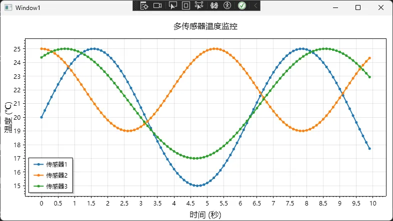 这段代码展示了几个实用技巧:
- 复用X轴数据:多条曲线共享同一个时间轴,节省内存
- 返回值操作:AddScatter返回的对象可以进一步设置样式
- 图例显示:Legend()方法自动根据label参数生成图例
应用场景:我在一个环境监控系统里就是这么做的,实时显示温度、湿度、CO2浓度三条曲线,客户看着特别直观。
📊 三种典型场景的完整实现
场景一:实时数据流更新
这是最常见的需求,比如股票走势、设备监控、心电图等。关键是要高效更新数据,避免卡顿。
csharppublic partial class Window2 : Window
{
    private readonly List<double> dataPoints = new();
    private readonly Random random = new();
    private DispatcherTimer? timer;

    public Window2()
    {
        InitializeComponent();
        InitializeRealtimeChart();
    }

    private void InitializeRealtimeChart()
    {
        wpfPlot1.Plot.Font.Set("Microsoft YaHei");
        for (int i = 0; i < 50; i++)
        {
            dataPoints.Add(20 + random.NextDouble() * 5);
        }

        RenderScatter();
        wpfPlot1.Refresh();

        timer = new DispatcherTimer
        {
            Interval = TimeSpan.FromMilliseconds(100)
        };
        timer.Tick += Timer_Tick;
        timer.Start();
    }

    private void RenderScatter()
    {
        double[] xData = Enumerable.Range(0, dataPoints.Count).Select(i => (double)i).ToArray();
        double[] yData = dataPoints.ToArray();

        wpfPlot1.Plot.Clear();

        var scatter = wpfPlot1.Plot.Add.Scatter(xData, yData);
        scatter.Color = new ScottPlot.Color(0, 120, 215);
        scatter.LineWidth = 2;
        scatter.MarkerSize = 0;

        wpfPlot1.Plot.Axes.Bottom.Label.FontName = "Microsoft YaHei";
        wpfPlot1.Plot.Axes.Left.Label.FontName = "Microsoft YaHei";
        wpfPlot1.Plot.XLabel("时间点");
        wpfPlot1.Plot.YLabel("数值");
        wpfPlot1.Plot.Title("实时数据监控");
        wpfPlot1.Plot.Axes.SetLimits(left: 15, top: 30, right: 50, bottom: 0);
    }

    private void Timer_Tick(object? sender, EventArgs e)
    {
        dataPoints.Add(20 + random.NextDouble() * 5);

        if (dataPoints.Count > 50)
        {
            dataPoints.RemoveAt(0);
        }

        RenderScatter();
        wpfPlot1.Refresh();
    }
}
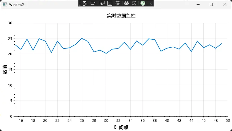 踩坑预警:
踩坑预警:
- 注意List的内存管理,别让数据无限增长导致内存泄漏
- 固定坐标轴范围能避免图表上下跳动,用户体验更好
场景二:柱状图对比分析
假设你要做个销售数据对比,展示本月各产品线的销售额:
csharpprivate void CreateBarChart()
{
    // 产品名称和销售额
    string[] products = { "产品A", "产品B", "产品C", "产品D", "产品E" };
    double[] sales = { 125. 5, 89.3, 156.8, 98.2, 134.7 }; // 单位:万元

    // 创建柱状图
    var barPlot = wpfPlot1.Plot.AddBar(sales);

    // 设置柱子颜色(渐变效果)
    barPlot. FillColor = System.Drawing.Color.FromArgb(200, 255, 165, 0);
    barPlot.BorderColor = System.Drawing.Color.FromArgb(255, 255, 140, 0);

    // 设置X轴标签
    wpfPlot1.Plot.XTicks(Enumerable.Range(0, products.Length).Select(i => (double)i).ToArray(), products);

    // 旋转标签避免重叠
    wpfPlot1.Plot.XAxis. TickLabelStyle(rotation: 45);

    // 添加数值标签
    for (int i = 0; i < sales.Length; i++)
    {
        wpfPlot1.Plot.AddText($"{sales[i]: F1}万", i, sales[i] + 5,
                              size: 12, color: System. Drawing.Color.Black);
    }

    wpfPlot1.Plot.YLabel("销售额 (万元)");
    wpfPlot1.Plot.Title("2024年1月产品销售对比");

    // 设置Y轴从0开始
    wpfPlot1.Plot.SetAxisLimits(yMin: 0);

    wpfPlot1.Refresh();
}
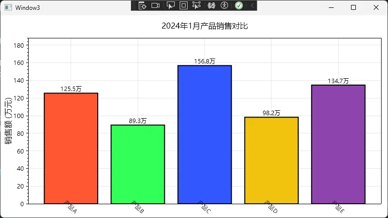 这个实现有几个小细节值得注意:
- Add.Text可以在柱子上方显示具体数值,特别实用
- 旋转标签解决了中文标签重叠的问题,这是我调试了好几次才发现的技巧
- Y轴从0开始是数据可视化的最佳实践,避免误导读者
场景三:信号分析(带阈值线)
工业控制里经常要监控某个参数是否超限,这时候需要在图表上画几条阈值线:
csharpprivate void CreateSignalChart()
{
    // 清除之前的图表
    wpfPlot1.Plot.Clear();
    wpfPlot1.Plot.Font.Set("Microsoft YaHei");
    wpfPlot1.Plot.Axes.Bottom.Label.FontName = "Microsoft YaHei";
    wpfPlot1.Plot.Axes.Left.Label.FontName = "Microsoft YaHei";

    // 模拟采集的电压信号
    int pointCount = 200;
    double[] time = Enumerable.Range(0, pointCount).Select(i => i * 0.01).ToArray();
    double[] voltage = new double[pointCount];

    Random rand = new Random();
    for (int i = 0; i < pointCount; i++)
    {
        voltage[i] = 14 + Math.Sin(time[i] * 10) * 2 + (rand.NextDouble() - 0.5) * 0.5;
    }

    // 绘制信号曲线
    var signalPlot = wpfPlot1.Plot.Add.Scatter(time, voltage);
    signalPlot.Color = ScottPlot.Color.FromHex("#660000");
    signalPlot.LineWidth = 1.5f;
    signalPlot.LegendText = "电压信号";

    // 添加上限阈值线
    var upperLimit = wpfPlot1.Plot.Add.HorizontalLine(14.5);
    upperLimit.LineWidth = 2;
    upperLimit.LineColor = ScottPlot.Color.FromHex("#FF0000");
    upperLimit.LinePattern = LinePattern.Solid;
    upperLimit.LegendText = "上限 (14.5V)";

    // 添加下限阈值线
    var lowerLimit = wpfPlot1.Plot.Add.HorizontalLine(9.5);
    lowerLimit.LineWidth = 2;
    lowerLimit.LineColor = ScottPlot.Color.FromHex("#0000FF");
    lowerLimit.LinePattern = LinePattern.Dashed;
    lowerLimit.LegendText = "下限 (9.5V)";

    // 标注超限点 - 创建超限点的数组
    List<double> outlierTimes = new List<double>();
    List<double> outlierVoltages = new List<double>();

    for (int i = 0; i < pointCount; i++)
    {
        if (voltage[i] > 14.5 || voltage[i] < 9.5)
        {
            outlierTimes.Add(time[i]);
            outlierVoltages.Add(voltage[i]);
        }
    }

    // 如果有超限点,添加到图表
    if (outlierTimes.Count > 0)
    {
        var outlierPlot = wpfPlot1.Plot.Add.Scatter(outlierTimes.ToArray(), outlierVoltages.ToArray());
        outlierPlot.Color = ScottPlot.Color.FromHex("#FF0000");
        outlierPlot.MarkerSize = 4;
        outlierPlot.LineWidth = 0; // 只显示点,不显示线
        outlierPlot.LegendText = "超限点";
    }

    // 设置图例
    wpfPlot1.Plot.Legend.IsVisible = true;
    wpfPlot1.Plot.Legend.Alignment = Alignment.LowerRight;

    // 设置轴标签和标题
    wpfPlot1.Plot.Axes.Left.Label.Text = "电压 (V)";
    wpfPlot1.Plot.Axes.Bottom.Label.Text = "时间 (秒)";
    wpfPlot1.Plot.Title("电压监控 - 超限检测");

    // 刷新图表
    wpfPlot1.Refresh();
}
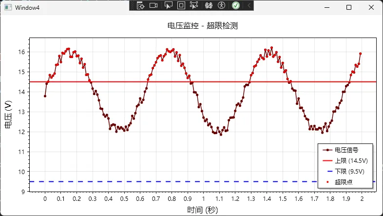 实战经验:在做电池管理系统时就用了这套方案,把充电电压、电流的安全范围标出来,一旦数据点超出阈值就用红点高亮显示。
🔥 常见问题与解决方案
问题1:中文字体显示为方框
这是. NET绘图组件的老问题了,解决方法是手动指定中文字体:
csharp// 设置字体,这个是4.x版本变化比较大
wpfPlot1.Plot.Font.Set("Microsoft YaHei");
wpfPlot1.Plot.Axes.Bottom.Label.FontName = "Microsoft YaHei";
wpfPlot1.Plot.Axes.Left.Label.FontName = "Microsoft YaHei";
问题2:图表在高DPI屏幕上模糊
WPF在高DPI下有个坑,需要在App.xaml.cs里加这段:
csharppublic partial class App : Application
{
    [System.Runtime.InteropServices.DllImport("user32.dll")]
    private static extern bool SetProcessDPIAware();
    protected override void OnStartup(StartupEventArgs e)
    {
        // 启用DPI感知
        if (Environment.OSVersion.Version.Major >= 6)
        {
            SetProcessDPIAware();
        }
        base.OnStartup(e);
    }
}
问题3:导出图片分辨率太低
默认导出是按屏幕分辨率来的,想要高清图片得这么写:
csharp// 导出4K分辨率的PNG图片
wpfPlot1.Plot.SavePng("output.png", width: 3840, height: 2160);
我在给客户做报告生成功能时,就是用这个方法导出高清图表,打印出来效果特别好。
🎓 写在最后
好了,到这里你应该已经掌握了ScottPlot在WPF项目中的核心用法。简单总结三个要点:
- 环境搭建别大意:一定要装对NuGet包(ScottPlot.WPF),. NET Framework项目注意版本兼容性
- 性能优化记三招:大数据用Signal、调低渲染质量换性能
最后甩三个金句给你收藏:
- ✨ "数据可视化不是炫技,关键是让读者一秒看懂核心信息"
- ✨ "性能优化的本质是减少不必要的计算,而不是追求最酷的算法"
- ✨ "好的图表库应该让你专注业务逻辑,而不是纠结绘图细节"
💬 来聊聊你的实战场景
你在项目中遇到过哪些图表展示的难题?或者你有什么ScottPlot的使用技巧想分享?欢迎在评论区留言交流!
如果这篇文章帮到了你,不妨点个在看或转发给同样在做WPF开发的朋友,咱们一起进步 💪
相关技术标签:#CSharp开发 #WPF #数据可视化 #性能优化 #ScottPlot
本文作者:技术老小子
本文链接:
版权声明:本博客所有文章除特别声明外,均采用 BY-NC-SA 许可协议。转载请注明出处!