Press Ctrl+ and K to search
SkiaSharp 是一个强大的跨平台 2D 图形库,提供了灵活且高效的图像处理能力。本文将深入探讨 SkiaSharp 中图像裁剪的各种技术和方法。
Nuget 安装包
C#SkiaSharp
SkiaSharp.Views.WindowsForms
基本图像裁剪
核心功能
- 图像打开:支持打开JPG、JPEG、PNG和BMP格式的图像文件
- 交互式选择区域:用户可以通过鼠标在图像上拖拽选择要裁剪的矩形区域
- 实时预览:选择过程中实时显示选择框和区域尺寸信息
- 图像裁剪:使用SkiaSharp库执行图像裁剪操作
- 裁剪结果保存:支持将裁剪后的图像保存为新文件
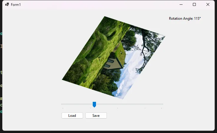
SkiaSharp 提供了强大的图像处理能力,其中图像旋转是最常用的操作之一。本文将深入探讨SkiaSharp中图像旋转的多种方法和技巧。
Nuget 安装包
C#SkiaSharp
SkiaSharp.Views.WindowsForms
基本旋转方法
简单角度旋转
C#using System.Windows.Forms;
using SkiaSharp;

namespace AppRotation
{
    public partial class Form1 : Form
    {
        private SKBitmap originalBitmap;
        private string currentImagePath;
        public Form1()
        {
            InitializeComponent();
        }

        private void btnLoad_Click(object sender, EventArgs e)
        {
            using (OpenFileDialog openFileDialog = new OpenFileDialog())
            {
                openFileDialog.Filter = "Image Files|*.png;*.jpg;*.jpeg;*.bmp;*.gif";
                if (openFileDialog.ShowDialog() == DialogResult.OK)
                {
                    currentImagePath = openFileDialog.FileName;
                    using (var fileStream = new FileStream(currentImagePath, FileMode.Open))
                    {
                        originalBitmap = SKBitmap.Decode(fileStream);
                        UpdateRotatedImage(pic, tbAngle.Value);
                        btnSave.Enabled = true;
                    }
                }
            }
        }

        private void tbAngle_Scroll(object sender, EventArgs e)
        {
            lblAngle.Text = $"Rotation Angle: {tbAngle.Value}°";
            if (originalBitmap != null)
            {
                UpdateRotatedImage(pic, tbAngle.Value);
            }
        }

        private void btnSave_Click(object sender, EventArgs e)
        {
            if (originalBitmap == null) return;

            using (SaveFileDialog saveFileDialog = new SaveFileDialog())
            {
                saveFileDialog.Filter = "PNG Image|*.png|JPEG Image|*.jpg|BMP Image|*.bmp";
                saveFileDialog.DefaultExt = "png";
                saveFileDialog.AddExtension = true;

                if (saveFileDialog.ShowDialog() == DialogResult.OK)
                {
                    using (SKBitmap rotatedBitmap = RotateImage(originalBitmap, tbAngle.Value))
                    {
                        using (SKImage image = SKImage.FromBitmap(rotatedBitmap))
                        using (SKData data = image.Encode(SKEncodedImageFormat.Png, 100))
                        using (FileStream stream = new FileStream(saveFileDialog.FileName, FileMode.Create))
                        {
                            data.SaveTo(stream);
                        }
                    }
                    MessageBox.Show("Image saved successfully!", "Success", MessageBoxButtons.OK, MessageBoxIcon.Information);
                }
            }
        }

        private void UpdateRotatedImage(PictureBox pic, int angle)
        {
            if (originalBitmap == null) return;

            using (SKBitmap rotatedBitmap = RotateImage(originalBitmap, angle))
            {
                using (SKImage image = SKImage.FromBitmap(rotatedBitmap))
                using (SKData data = image.Encode())
                using (MemoryStream memStream = new MemoryStream())
                {
                    data.SaveTo(memStream);
                    memStream.Position = 0;

                    if (pic.Image != null)
                    {
                        pic.Image.Dispose();
                    }

                    pic.Image = new Bitmap(memStream);
                }
            }
        }

        public SKBitmap RotateImage(SKBitmap originalBitmap, float angle)
        {
            // 创建一个新的位图,大小适应旋转后的图像
            SKBitmap rotatedBitmap = new SKBitmap(
                (int)(Math.Abs(originalBitmap.Width * Math.Cos(angle * Math.PI / 180)) +
                      Math.Abs(originalBitmap.Height * Math.Sin(angle * Math.PI / 180))),
                (int)(Math.Abs(originalBitmap.Width * Math.Sin(angle * Math.PI / 180)) +
                      Math.Abs(originalBitmap.Height * Math.Cos(angle * Math.PI / 180)))
            );

            using (SKCanvas canvas = new SKCanvas(rotatedBitmap))
            {
                // Clear canvas with transparent background
                canvas.Clear(SKColors.Transparent);

                // 将画布中心移动到图像中心
                canvas.Translate(rotatedBitmap.Width / 2f, rotatedBitmap.Height / 2f);

                // 旋转画布
                canvas.RotateDegrees(angle);

                // 绘制原始图像,使其居中
                canvas.DrawBitmap(originalBitmap,
                    new SKPoint(-originalBitmap.Width / 2f, -originalBitmap.Height / 2f));
            }

            return rotatedBitmap;
        }
    }
}
SkiaSharp 提供了多种强大的图像缩放方法,可以满足不同场景下的图像处理需求。本文将详细探讨 SkiaSharp 中图像缩放的各种技术和最佳实践。
Nuget 安装包
C#SkiaSharp
SkiaSharp.Views.WindowsForms
基本缩放方法
等比例缩放
C#using System.Windows.Forms;
using SkiaSharp;

namespace AppImageScaling
{
    public partial class Form1 : Form
    {
        private SKBitmap originalImage;
        public Form1()
        {
            InitializeComponent();
        }

        private void btnLoad_Click(object sender, EventArgs e)
        {
            using (OpenFileDialog openFileDialog = new OpenFileDialog())
            {
                openFileDialog.Filter = "Image Files|*.bmp;*.jpg;*.jpeg;*.png;*.gif";
                if (openFileDialog.ShowDialog() == DialogResult.OK)
                {
                    originalImage = SKBitmap.Decode(openFileDialog.FileName);
                    SKBitmap scaledImage = ScaleImageProportionally(originalImage, 400);
                    pic.Image = BitmapFromSKBitmap(scaledImage);
                }
            }
        }

        public SKBitmap ScaleImageProportionally(SKBitmap originalImage, int targetWidth)
        {
            // 计算等比例缩放的高度
            float aspectRatio = (float)originalImage.Height / originalImage.Width;
            int targetHeight = (int)(targetWidth * aspectRatio);

            // 创建缩放后的位图
            SKBitmap scaledBitmap = new SKBitmap(targetWidth, targetHeight);

            // 使用高质量缩放
            using (SKCanvas canvas = new SKCanvas(scaledBitmap))
            {
                canvas.SetMatrix(SKMatrix.CreateScale(
                    (float)targetWidth / originalImage.Width,
                    (float)targetHeight / originalImage.Height
                ));

                // 绘制原始图像
                canvas.DrawBitmap(originalImage, 0, 0);
            }

            return scaledBitmap;
        }

        private Bitmap BitmapFromSKBitmap(SKBitmap skBitmap)
        {
            using (var image = SKImage.FromBitmap(skBitmap))
            using (var data = image.Encode(SKEncodedImageFormat.Png, 100))
            using (var stream = new System.IO.MemoryStream(data.ToArray()))
            {
                return new Bitmap(stream);
            }
        }

    }
}
SkiaSharp 是一个强大的跨平台 2D 图形库,提供了丰富的图像处理能力。本文将深入探讨 SkiaSharp 中图像的加载、保存和基本操作。
Nuget 安装包
C#SkiaSharp
SkiaSharp.Views.WindowsForms
图像加载基础
从文件加载图像
C#using System.Drawing;
using System.Windows.Forms;
using SkiaSharp;
using SkiaSharp.Views.Desktop;

namespace AppLoadSave
{
    public partial class Form1 : Form
    {
        private SKBitmap loadedBitmap;
        public Form1()
        {
            InitializeComponent();
        }

        // 从文件加载图像的方法
        private SKBitmap LoadImageFromFile(string filePath)
        {
            try
            {
                // 使用 SKBitmap.Decode 方法加载图像
                using (var stream = System.IO.File.OpenRead(filePath))
                {
                    return SKBitmap.Decode(stream);
                }
            }
            catch (Exception ex)
            {
                MessageBox.Show($"图像加载错误: {ex.Message}", "错误"
                    , MessageBoxButtons.OK, MessageBoxIcon.Error);
                return null;
            }
        }

        private Bitmap SKBitmapToSystemBitmap(SKBitmap skBitmap)
        {
            // 创建一个新的 Bitmap,使用 SKBitmap 的宽度和高度
            Bitmap bitmap = new Bitmap(skBitmap.Width, skBitmap.Height,
                System.Drawing.Imaging.PixelFormat.Format32bppPArgb);

            // 锁定位图的位图数据
            System.Drawing.Imaging.BitmapData bmpData = bitmap.LockBits(
                new Rectangle(0, 0, bitmap.Width, bitmap.Height),
                System.Drawing.Imaging.ImageLockMode.WriteOnly,
                bitmap.PixelFormat);

            // 复制像素数据
            IntPtr ptr = bmpData.Scan0;
            int bytes = Math.Abs(bmpData.Stride) * bitmap.Height;
            byte[] rgbValues = new byte[bytes];

            // 从 SKBitmap 获取像素数据
            byte[] skPixels = skBitmap.Bytes;

            // 转换颜色通道(BGRA to ARGB)
            for (int i = 0; i < skPixels.Length; i += 4)
            {
                rgbValues[i] = skPixels[i + 2];     // B
                rgbValues[i + 1] = skPixels[i + 1]; // G
                rgbValues[i + 2] = skPixels[i];     // R
                rgbValues[i + 3] = skPixels[i + 3]; // A
            }

            // 将像素数据复制到位图
            System.Runtime.InteropServices.Marshal.Copy(rgbValues, 0, ptr, bytes);
            bitmap.UnlockBits(bmpData);

            return bitmap;
        }

        private void btnLoad_Click(object sender, EventArgs e)
        {
            using (OpenFileDialog openFileDialog = new OpenFileDialog())
            {
                openFileDialog.Filter = "图像文件|*.jpg;*.jpeg;*.png;*.bmp;*.gif";
                openFileDialog.Title = "选择图像文件";

                if (openFileDialog.ShowDialog() == DialogResult.OK)
                {
                    // 加载图像
                    loadedBitmap = LoadImageFromFile(openFileDialog.FileName);

                    if (loadedBitmap != null)
                    {
                        // 直接从 SKBitmap 创建 Bitmap
                        Bitmap bitmap = SKBitmapToSystemBitmap(loadedBitmap);
                        pic.Image = bitmap;

                    }
                }
            }
        }
    }
}
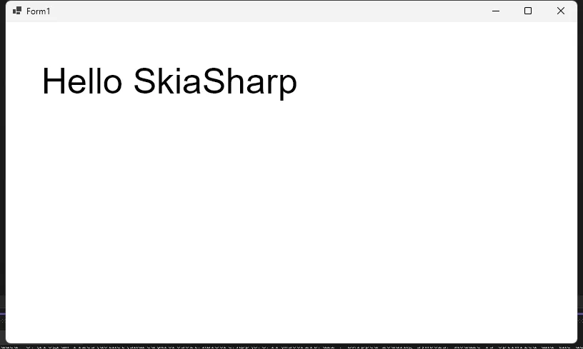
文本渲染基础
SkiaSharp 提供了丰富的文本渲染和特效能力,让开发者可以创造出极具视觉吸引力的文字效果。本文将深入探讨 SkiaSharp 中文本特效的各种技巧和方法。
Nuget 安装包
C#SkiaSharp
SkiaSharp.Views.WindowsForms
基本文本绘制
C#public void DrawSimpleText(SKCanvas canvas)
{
    // 创建画笔
    using var paint = new SKPaint
    {
        TextSize = 50,
        Color = SKColors.Black,
        IsAntialias = true,
        Typeface = SKTypeface.FromFamilyName("Arial")
    };

    // 绘制基础文本
    canvas.DrawText("Hello SkiaSharp", 50, 100, paint);
}