
目录
你是否经常为Matplotlib绘图中的**Figure和Axes**概念感到困惑?
在Python数据可视化开发中,特别是Windows环境下的上位机开发,很多开发者在使用Matplotlib时都会遇到这样的问题:代码能跑,图能出来,但总感觉对底层逻辑一知半解。当需要创建复杂的多子图布局或精确控制图形属性时,就显得束手束脚。
本文将从实战角度出发,用通俗易懂的方式帮你彻底理解Matplotlib的Figure和Axes概念,掌握创建图形的不同方式,并学会灵活运用plt.subplots()函数。无论你是数据分析新手还是有一定基础的开发者,这篇文章都能让你的Python可视化技能更上一层楼。
🎨 Figure与Axes:画布与画板的关系
🤔 概念解析:一个形象的比喻
想象你在画画:
- Figure 就像是你的画布(整张纸)
- Axes 就像是画板(纸上的绘图区域)
在一张画布上,你可以放置多个画板,每个画板都可以独立绘制不同的内容。
Pythonimport matplotlib.pyplot as plt
import numpy as np
# 设置中文字体支持
plt.rcParams['font.sans-serif'] = ['SimHei', 'Microsoft YaHei', 'DejaVu Sans'] # 设置字体
plt.rcParams['axes.unicode_minus'] = False
# 使用标准后端而不是PyCharm的后端
import matplotlib
matplotlib.use('TkAgg') # 或者 'Qt5Agg'
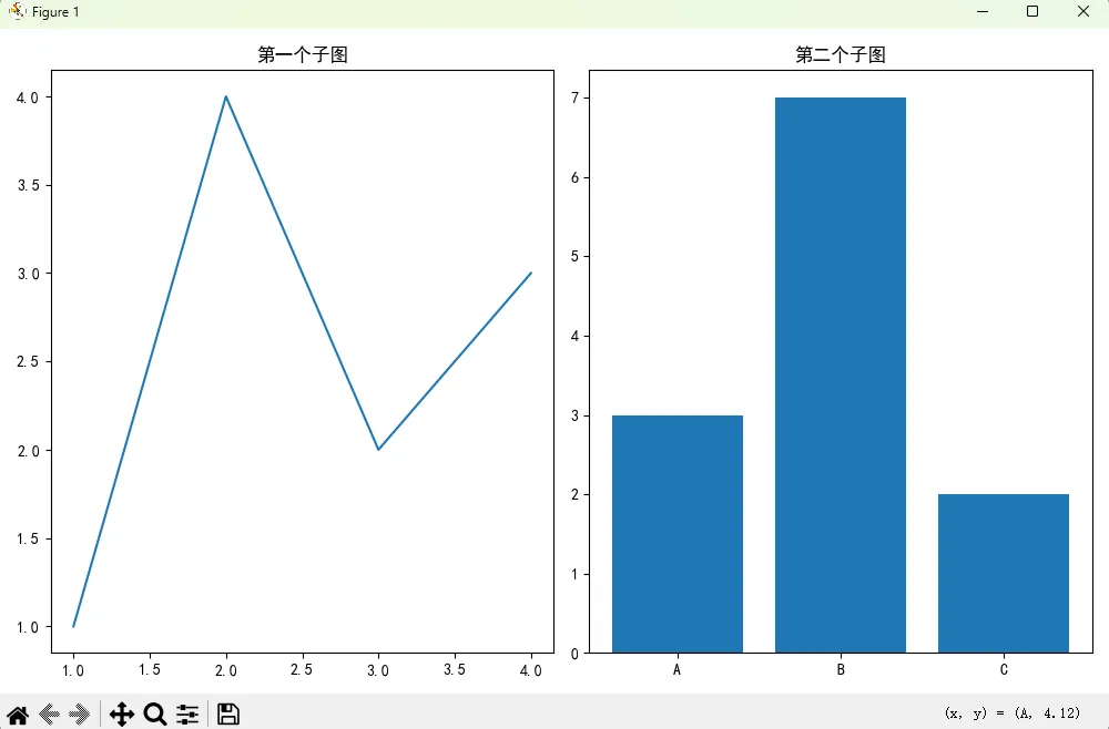
# 创建一个Figure(画布)
fig = plt.figure(figsize=(10, 6))
# 在画布上添加第一个Axes(画板)
ax1 = fig.add_subplot(1, 2, 1) # 1行2列的第1个位置
ax1.plot([1, 2, 3, 4], [1, 4, 2, 3])
ax1.set_title('第一个子图')
# 在画布上添加第二个Axes(画板)
ax2 = fig.add_subplot(1, 2, 2) # 1行2列的第2个位置
ax2.bar(['A', 'B', 'C'], [3, 7, 2])
ax2.set_title('第二个子图')
plt.tight_layout() # 自动调整子图间距
plt.show()
在 PyCharm 中,进入 File → Settings → Tools → Python Scientific → Show plots in tool window,取消勾选这个选项,这样图表会在独立窗口中显示,避免使用 PyCharm 的内置后端
💡 核心区别总结
| 概念 | 作用 | 特点 | 常用方法 |
|---|---|---|---|
| Figure | 整个图形窗口/画布 | 包含所有图形元素 | set_size_inches(), savefig() |
| Axes | 具体的绘图区域 | 包含数据、坐标轴、标签 | plot(), bar(), set_title() |
🛠️ 创建图形的三种主流方式
方式一:pyplot接口(最简单)
Pythonimport matplotlib.pyplot as plt
import numpy as np

# 设置中文字体支持
plt.rcParams['font.sans-serif'] = ['SimHei', 'Microsoft YaHei', 'DejaVu Sans']  # 设置字体
plt.rcParams['axes.unicode_minus'] = False

# 使用标准后端而不是PyCharm的后端
import matplotlib
matplotlib.use('TkAgg')  # 或者 'Qt5Agg'

# 直接使用plt绘图,自动创建Figure和Axes
plt.figure(figsize=(8, 5))
plt.plot([1, 2, 3, 4], [1, 4, 2, 3])
plt.title('使用pyplot接口')
plt.show()
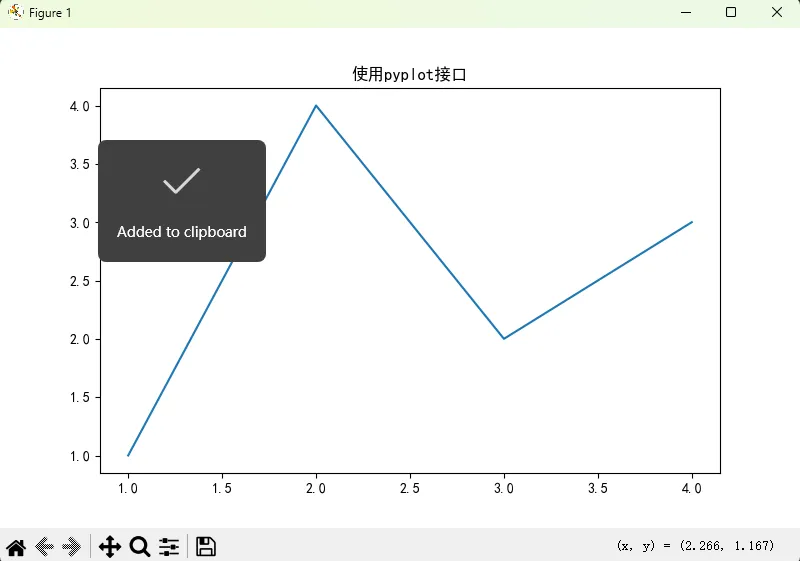
适用场景:快速绘制简单图形,适合数据探索阶段。
方式二:面向对象接口(推荐)
Pythonimport matplotlib.pyplot as plt

# 显式创建Figure和Axes对象
fig, ax = plt.subplots(figsize=(8, 5))
ax.plot([1, 2, 3, 4], [1, 4, 2, 3])
ax.set_title('使用面向对象接口')
plt.show()
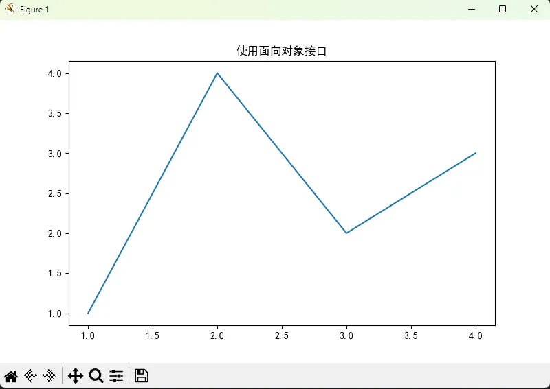
适用场景:需要精确控制图形属性,特别是在上位机开发中嵌入GUI界面时。
方式三:手动创建(高级用法)
Pythonimport matplotlib.pyplot as plt

# 手动创建Figure
fig = plt.figure(figsize=(8, 5))

# 手动添加Axes,参数:[左, 下, 宽, 高](相对位置,0-1之间)
ax = fig.add_axes([0.1, 0.1, 0.8, 0.8])
ax.plot([1, 2, 3, 4], [1, 4, 2, 3])
ax.set_title('手动创建方式')
plt.show()
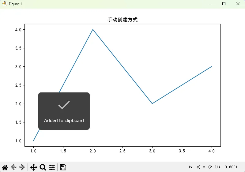
适用场景:需要创建不规则布局或特殊位置的子图。
🎯 plt.subplots()详解:Python开发者的利器
📊 基础用法
Pythonimport matplotlib.pyplot as plt
import numpy as np
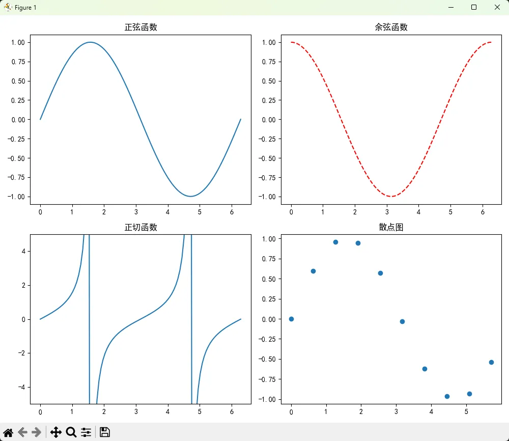
# 创建2x2的子图布局
fig, axes = plt.subplots(2, 2, figsize=(10, 8))
# 生成示例数据
x = np.linspace(0, 2*np.pi, 100)
# 在每个子图中绘制不同的图形
axes[0, 0].plot(x, np.sin(x))
axes[0, 0].set_title('正弦函数')
axes[0, 1].plot(x, np.cos(x), 'r--')
axes[0, 1].set_title('余弦函数')
axes[1, 0].plot(x, np.tan(x))
axes[1, 0].set_title('正切函数')
axes[1, 0].set_ylim(-5, 5) # 限制y轴范围
axes[1, 1].scatter(x[::10], np.sin(x[::10]))
axes[1, 1].set_title('散点图')
plt.tight_layout()
plt.show()
🔧 高级参数详解
Pythonimport matplotlib.pyplot as plt
import numpy as np

# 使用高级参数创建复杂布局
fig, axes = plt.subplots(
    nrows=2,           # 行数
    ncols=3,           # 列数
    figsize=(12, 8),   # 图形尺寸
    dpi=100,           # 分辨率
    sharex=True,       # 共享x轴
    sharey=False,      # 不共享y轴
    subplot_kw={       # 传递给每个子图的参数
        'facecolor': 'lightgray',
        'alpha': 0.5
    }
)

# 生成数据
x = np.arange(10)
for i, ax in enumerate(axes.flat):
    ax.bar(x, np.random.randint(1, 10, 10))
    ax.set_title(f'子图 {i+1}')

plt.suptitle('共享x轴的多子图示例', fontsize=16)
plt.tight_layout()
plt.show()
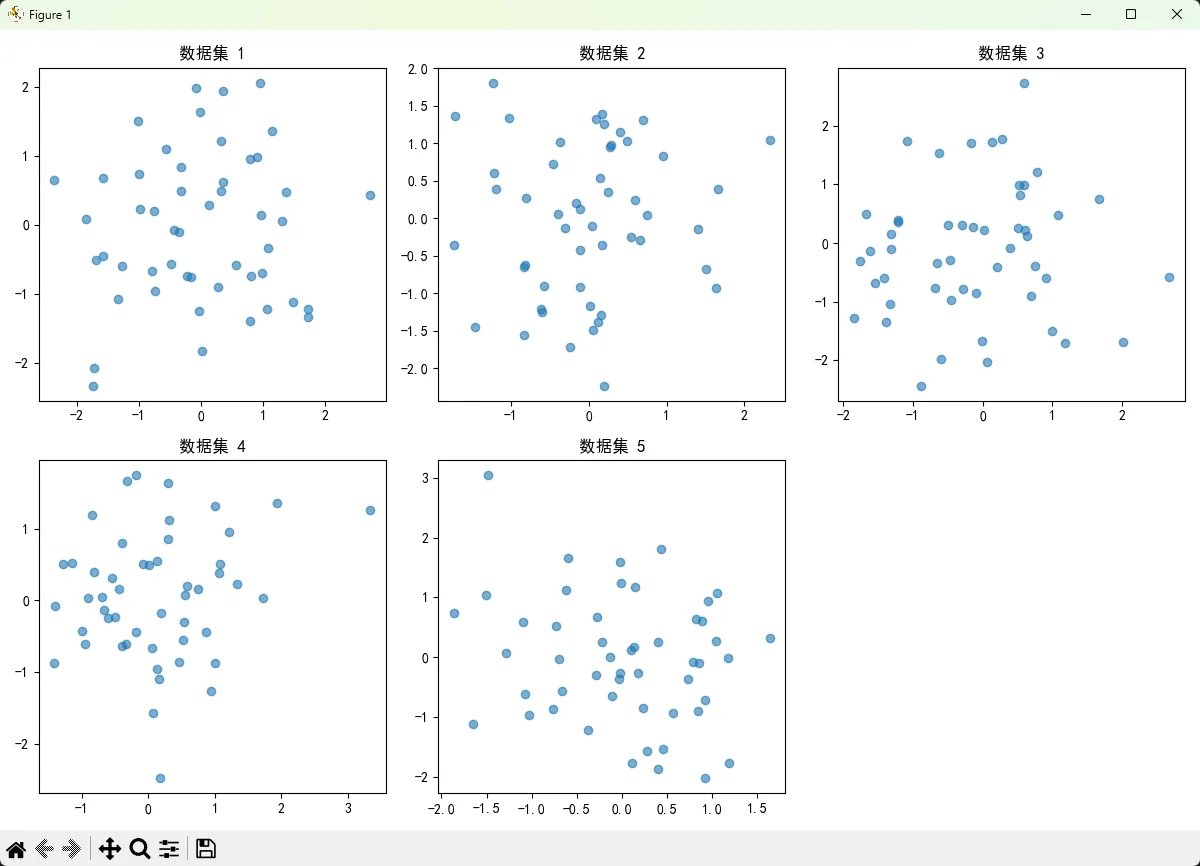
💼 实战技巧:处理不同数量的子图
Pythonimport matplotlib.pyplot as plt
import numpy as np

def create_adaptive_subplots(n_plots):
    """根据图形数量自动调整子图布局"""
    if n_plots == 1:
        return plt.subplots(1, 1, figsize=(6, 4))
    elif n_plots <= 2:
        return plt.subplots(1, 2, figsize=(10, 4))
    elif n_plots <= 4:
        return plt.subplots(2, 2, figsize=(10, 8))
    elif n_plots <= 6:
        return plt.subplots(2, 3, figsize=(12, 8))
    else:
        rows = int(np.ceil(n_plots / 3))
        return plt.subplots(rows, 3, figsize=(12, 4*rows))

# 使用示例
n = 5  # 假设要创建5个图形
fig, axes = create_adaptive_subplots(n)

# 确保axes始终是数组形式
if n == 1:
    axes = [axes]
elif n <= 2:
    axes = axes.flatten()
else:
    axes = axes.flatten()

for i in range(n):
    x = np.random.randn(50)
    y = np.random.randn(50)
    axes[i].scatter(x, y, alpha=0.6)
    axes[i].set_title(f'数据集 {i+1}')

# 隐藏多余的子图
for i in range(n, len(axes)):
    axes[i].set_visible(False)

plt.tight_layout()
plt.show()
📏 图形尺寸与分辨率设置:让你的图形更专业
🎨 尺寸控制技巧
Pythonimport matplotlib.pyplot as plt
import numpy as np
# 方法1:创建时指定尺寸
fig, ax = plt.subplots(figsize=(10, 6)) # 宽10英寸,高6英寸
# 方法2:创建后修改尺寸
fig.set_size_inches(12, 8)
# 方法3:使用rcParams全局设置
plt.rcParams['figure.figsize'] = [10, 6]
plt.rcParams['figure.dpi'] = 100
# 绘制示例图形
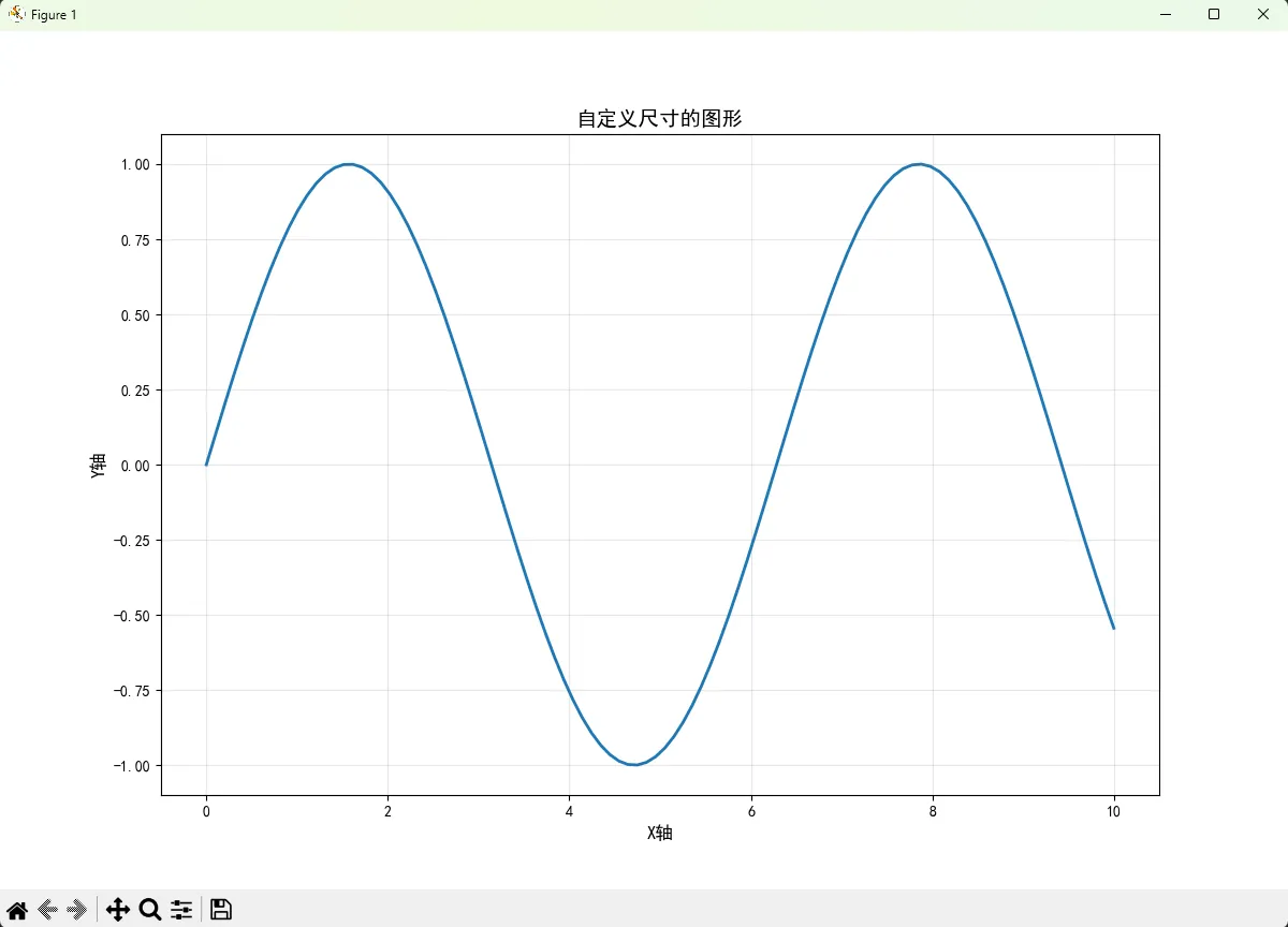
x = np.linspace(0, 10, 100)
y = np.sin(x)
ax.plot(x, y, linewidth=2)
ax.set_title('自定义尺寸的图形', fontsize=14)
ax.set_xlabel('X轴', fontsize=12)
ax.set_ylabel('Y轴', fontsize=12)
ax.grid(True, alpha=0.3)
plt.show()
🖼️ 分辨率优化:适配不同显示需求
Pythonimport matplotlib.pyplot as plt
import numpy as np
# 针对不同用途的分辨率设置
def create_figure_for_purpose(purpose='screen'):
"""根据用途创建合适分辨率的图形"""
if purpose == 'screen':
# 屏幕显示:72-100 DPI
fig, ax = plt.subplots(figsize=(10, 6), dpi=100)
elif purpose == 'print':
# 打印输出:300+ DPI
fig, ax = plt.subplots(figsize=(10, 6), dpi=300)
elif purpose == 'presentation':
# 演示文稿:较大尺寸,中等分辨率
fig, ax = plt.subplots(figsize=(12, 8), dpi=150)
else:
# 默认设置
fig, ax = plt.subplots(figsize=(8, 6), dpi=100)
return fig, ax
# 使用示例
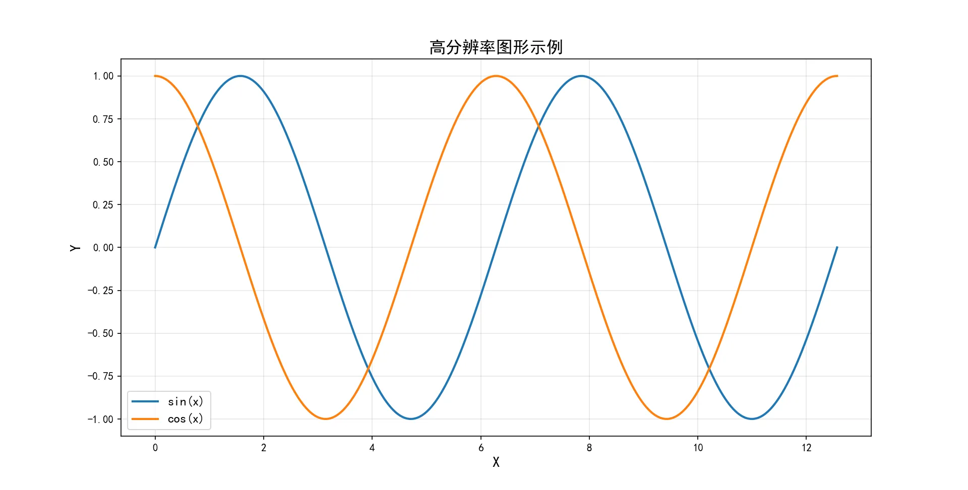
fig, ax = create_figure_for_purpose('presentation')
# 创建高质量的图形
x = np.linspace(0, 4*np.pi, 1000)
y1 = np.sin(x)
y2 = np.cos(x)
ax.plot(x, y1, label='sin(x)', linewidth=2)
ax.plot(x, y2, label='cos(x)', linewidth=2)
ax.set_title('高分辨率图形示例', fontsize=16)
ax.set_xlabel('X', fontsize=14)
ax.set_ylabel('Y', fontsize=14)
ax.legend(fontsize=12)
ax.grid(True, alpha=0.3)
# 保存高质量图片
plt.savefig('high_quality_plot.png', dpi=300, bbox_inches='tight')
plt.show()
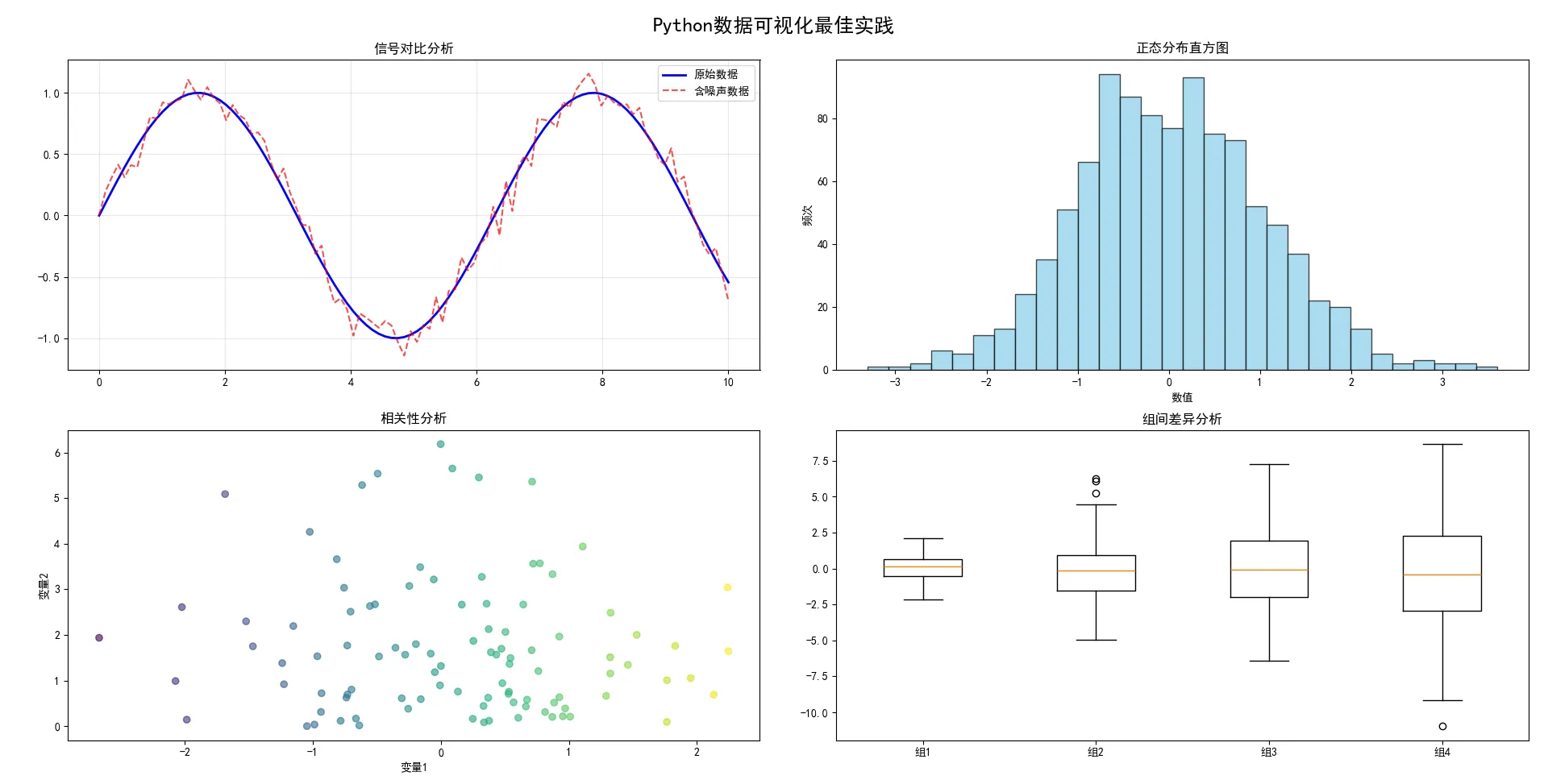
🔧 Windows环境下的实用设置
Pythonimport matplotlib.pyplot as plt
import matplotlib
import numpy as np

# Windows下的字体和显示优化
plt.rcParams['font.sans-serif'] = ['SimHei']  # 支持中文显示
plt.rcParams['axes.unicode_minus'] = False    # 解决负号显示问题
plt.rcParams['figure.autolayout'] = True     # 自动调整布局
plt.rcParams['savefig.dpi'] = 300            # 默认保存分辨率

# 创建专业外观的图形
fig, axes = plt.subplots(2, 2, figsize=(12, 10))
fig.suptitle('Python数据可视化最佳实践', fontsize=18, fontweight='bold')

# 数据准备
x = np.linspace(0, 10, 100)
data1 = np.random.normal(0, 1, 1000)
data2 = np.random.exponential(2, 1000)

# 子图1:折线图
axes[0, 0].plot(x, np.sin(x), 'b-', linewidth=2, label='原始数据')
axes[0, 0].plot(x, np.sin(x) + 0.1*np.random.randn(len(x)), 'r--', alpha=0.7, label='含噪声数据')
axes[0, 0].set_title('信号对比分析')
axes[0, 0].legend()
axes[0, 0].grid(True, alpha=0.3)

# 子图2:直方图
axes[0, 1].hist(data1, bins=30, alpha=0.7, color='skyblue', edgecolor='black')
axes[0, 1].set_title('正态分布直方图')
axes[0, 1].set_xlabel('数值')
axes[0, 1].set_ylabel('频次')

# 子图3:散点图
axes[1, 0].scatter(data1[:100], data2[:100], alpha=0.6, c=data1[:100], cmap='viridis')
axes[1, 0].set_title('相关性分析')
axes[1, 0].set_xlabel('变量1')
axes[1, 0].set_ylabel('变量2')

# 子图4:箱线图
box_data = [np.random.normal(0, std, 100) for std in range(1, 5)]
axes[1, 1].boxplot(box_data, labels=['组1', '组2', '组3', '组4'])
axes[1, 1].set_title('组间差异分析')

plt.tight_layout()
plt.show()
🏆 总结:掌握核心要点,提升Python编程技巧
通过本文的详细介绍,相信你已经对Matplotlib的Figure和Axes概念有了深入的理解。让我们回顾一下三个核心要点:
1. 概念理解:Figure是画布,Axes是画板,掌握这个比喻让你轻松理解Matplotlib的层次结构,为后续的Python开发和上位机开发打下坚实基础。
2. 实战技巧:plt.subplots()是创建复杂图形布局的最佳选择,通过合理的参数设置可以创建出专业级的数据可视化效果,这在编程技巧中属于高级应用。
3. 优化细节:图形尺寸和分辨率的精确控制能让你的作品在不同场景下都表现出色,特别是在Windows环境下的项目部署中显得尤为重要。
掌握了这些知识点,你就能在Python数据可视化的道路上游刃有余,无论是日常的数据分析还是复杂的上位机开发项目,都能创造出令人印象深刻的可视化效果。记住,实践是最好的老师,赶快动手试试这些代码示例吧!
本文作者:技术老小子
本文链接:
版权声明:本博客所有文章除特别声明外,均采用 BY-NC-SA 许可协议。转载请注明出处!