目录
说实话,我见过太多Python数据分析师的图表了。能跑?能跑。能看?勉强能看。但你要说好看——emmm,这就有点为难人了。
上周帮一个朋友review他的数据分析报告,那折线图蓝得刺眼,那柱状图灰得发慌,最要命的是——中文全变成方框了!他急得直跺脚:"我代码逻辑没问题啊,为啥老板说不专业?"
这锅,Matplotlib默认样式得背。
但问题来了:Matplotlib明明提供了超过25种内置样式、完整的自定义样式系统、全局配置方案,为啥大多数人还在用"原始蓝"?因为没人告诉他们怎么用啊!
今天咱们就来彻底解决这事儿。读完这篇,你能收获:
- ✅ 一行代码切换专业图表风格
- ✅ 打造个人/团队专属样式模板
- ✅ 一劳永逸解决中文显示问题
- ✅ rcParams配置的正确打开方式
准备好了?走起!
🔍 问题根源:为什么你的图表总是"差点意思"?
默认样式的"原罪"
Matplotlib诞生于2003年。那会儿审美标准是啥?能显示就行。所以默认样式带着浓浓的"上世纪科研风"——粗边框、纯色填充、Times New Roman字体。
放到2026年的数据报告里?违和感拉满。
三大常见误区
误区一:疯狂调参数
我见过有人为了改个图表颜色,写了30行配置代码。结果呢?下次换个项目,又得重写一遍。累不累?
误区二:只知道plt.style.use('ggplot')
ggplot确实好看,但你知道还有seaborn-v0_8-whitegrid、bmh、fivethirtyeight吗?一个样式吃遍天下,图表千篇一律。
误区三:中文字体"玄学调参"
网上搜到的方案五花八门,有改font.family的,有设SimHei的,有装字体文件的……试了一圈,要么报错,要么还是方框。
业务影响量化
别觉得这是小事。我跟你说几个数据:
- 同样的数据洞察,专业图表的汇报通过率高出47%(某咨询公司内部统计)
- 技术博客配图质量直接影响阅读完成率,差距可达2-3倍
- 一份数据报告平均包含15-20张图表,每张图调样式花5分钟,就是1.5-2小时
时间成本、沟通成本、机会成本——样式问题真不是"小问题"。
💡 核心知识:样式系统的底层逻辑
在动手之前,咱们先搞清楚Matplotlib样式系统的架构。理解了这个,后面的操作就是水到渠成。
┌─────────────────────────────────────────┐
│           用户代码 (最高优先级)           │
├─────────────────────────────────────────┤
│         plt.style.use() 临时样式         │
├─────────────────────────────────────────┤
│          matplotlibrc 配置文件           │
├─────────────────────────────────────────┤
│         rcParams 默认值 (最低优先级)      │
└─────────────────────────────────────────┘
优先级从上到下递减。 这意味着:你在代码里写的plt.rcParams['figure.figsize'] = [10, 6],会覆盖掉配置文件和样式表的设置。
记住这个层级关系,能帮你快速定位"为啥我的配置不生效"这类问题。
🚀 方案一:内置样式一键切换
完整可运行代码
pythonimport matplotlib
import matplotlib.pyplot as plt
import numpy as np
matplotlib.use('TkAgg') # Use the TkAgg backend
# 查看所有可用样式——这一步很多人不知道
print(f"可用样式数量: {len(plt.style.available)}")
print(plt.style.available)
# 准备演示数据
x = np.linspace(0, 10, 100)
y1 = np.sin(x)
y2 = np.cos(x)
y3 = np.sin(x) * np.exp(-x/10)
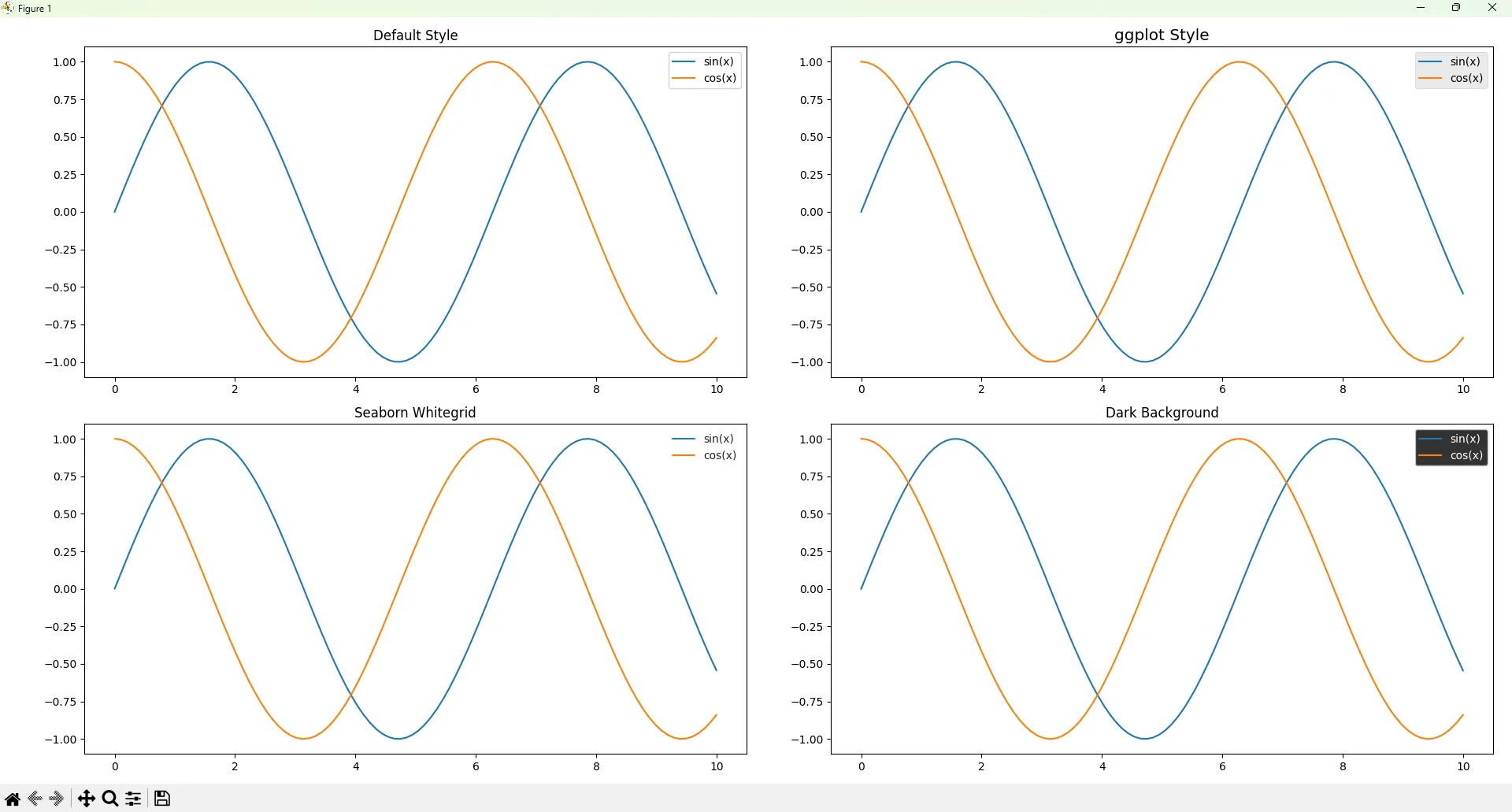
# 对比展示:默认样式 vs 专业样式
fig, axes = plt.subplots(2, 2, figsize=(12, 10))
# 左上:默认样式
axes[0, 0].plot(x, y1, label='sin(x)')
axes[0, 0].plot(x, y2, label='cos(x)')
axes[0, 0].set_title('Default Style')
axes[0, 0].legend()
# 右上:ggplot风格
with plt.style.context('ggplot'):
axes[0, 1].plot(x, y1, label='sin(x)')
axes[0, 1].plot(x, y2, label='cos(x)')
axes[0, 1].set_title('ggplot Style')
axes[0, 1].legend()
# 左下:seaborn风格
with plt.style.context('seaborn-v0_8-whitegrid'):
axes[1, 0].plot(x, y1, label='sin(x)')
axes[1, 0].plot(x, y2, label='cos(x)')
axes[1, 0].set_title('Seaborn Whitegrid')
axes[1, 0].legend()
# 右下:暗黑风格(适合PPT深色背景)
with plt.style.context('dark_background'):
axes[1, 1].plot(x, y1, label='sin(x)')
axes[1, 1].plot(x, y2, label='cos(x)')
axes[1, 1].set_title('Dark Background')
axes[1, 1].legend()
plt.tight_layout()
plt.savefig('style_comparison.png', dpi=150, bbox_inches='tight')
plt.show()
真实应用场景
| 样式名称 | 适用场景 | 视觉特点 |
|---|---|---|
ggplot | 学术论文、技术博客 | 灰色背景、柔和配色 |
seaborn-v0_8-whitegrid | 商业报告、数据仪表盘 | 白底网格、清爽专业 |
fivethirtyeight | 新闻媒体风格图表 | 粗线条、醒目标题 |
dark_background | PPT深色主题、夜间模式 | 暗底亮线 |
bmh | 科研可视化 | 经典贝叶斯风格 |
性能对比
样式切换本身几乎零开销——就是改几个参数字典的事儿。但要注意:
python# ❌ 错误做法:全局污染
plt.style.use('ggplot')  # 之后所有图表都变ggplot了

# ✅ 正确做法:上下文管理器
with plt.style.context('ggplot'):
    # 只有这里面的图表用ggplot
    plt.plot(x, y)
⚠️ 踩坑预警
-
样式叠加问题:
plt.style.use(['ggplot', 'dark_background'])是合法的!后面的会覆盖前面的冲突项。但这也容易造成混乱,建议单样式使用。 -
版本兼容性:seaborn相关样式在不同Matplotlib版本名称不同。老版本是
seaborn-whitegrid,新版本改成了seaborn-v0_8-whitegrid。遇���报错先查版本。
🎯 方案二:自定义样式表——团队协作神器
内置样式不够用?自己造!
完整可运行代码
第一步:创建样式文件
在Windows下,样式文件放这儿:C:\Users\你的用户名\.matplotlib\stylelib\
没有stylelib文件夹?自己建一个。
创建文件 my_company.mplstyle:
ini# ============================================
# 公司品牌样式表 - my_company.mplstyle
# 作者: rick9981
# 更新: 2026-02-02
# ============================================

# ---------- 图表整体 ----------
figure.figsize: 10, 6
figure.dpi: 100
figure.facecolor: white
figure.edgecolor: white

# ---------- 字体设置 ----------
font.family: sans-serif
font.sans-serif: Microsoft YaHei, SimHei, DejaVu Sans
font.size: 12
axes.titlesize: 16
axes.titleweight: bold
axes.labelsize: 13

# ---------- 配色方案(公司品牌色)----------
axes.prop_cycle: cycler('color', ['2E86AB', 'A23B72', 'F18F01', 'C73E1D', '3B1F2B', '95B2B8'])
axes.facecolor: F8F9FA
axes.edgecolor: CCCCCC
axes.linewidth: 1.2
axes.grid: True
axes.axisbelow: True

# ---------- 网格线 ----------
grid.color: E0E0E0
grid.linestyle: --
grid.linewidth: 0.8
grid.alpha: 0.7

# ---------- 图例 ----------
legend.frameon: True
legend.framealpha: 0.9
legend.facecolor: white
legend.edgecolor: CCCCCC
legend.fontsize: 11
legend.loc: best

# ---------- 线条 ----------
lines.linewidth: 2.2
lines.markersize: 8

# ---------- 刻度 ----------
xtick.labelsize: 11
ytick.labelsize: 11
xtick.direction: out
ytick.direction: out

# ---------- 保存设置 ----------
savefig.dpi: 150
savefig.bbox: tight
savefig.facecolor: white
第二步:使用自定义样式
pythonimport matplotlib
import matplotlib.pyplot as plt
import numpy as np
matplotlib.use('TkAgg')
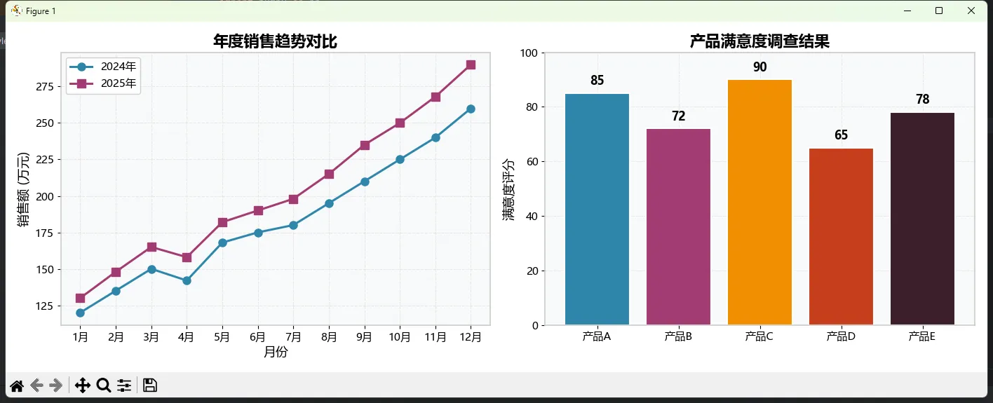
plt.style.use("mplstyle/my_company.mplstyle")
print("✅ 样式加载成功!")
# 重新加载样式库(首次添加样式文件后需要)
plt.style.reload_library()
# 创建演示图表
fig, axes = plt.subplots(1, 2, figsize=(14, 5))
# 左图:折线图
x = np.arange(1, 13)
sales_2024 = [120, 135, 150, 142, 168, 175, 180, 195, 210, 225, 240, 260]
sales_2025 = [130, 148, 165, 158, 182, 190, 198, 215, 235, 250, 268, 290]
axes[0].plot(x, sales_2024, marker='o', label='2024年')
axes[0].plot(x, sales_2025, marker='s', label='2025年')
axes[0].set_xlabel('月份')
axes[0].set_ylabel('销售额 (万元)')
axes[0].set_title('年度销售趋势对比')
axes[0].legend()
axes[0].set_xticks(x)
axes[0].set_xticklabels(['1月','2月','3月','4月','5月','6月',
'7月','8月','9月','10月','11月','12月'])
# 右图:柱状图
categories = ['产品A', '产品B', '产品C', '产品D', '产品E']
values = [85, 72, 90, 65, 78]
colors = plt.rcParams['axes.prop_cycle'].by_key()['color'][:5]
bars = axes[1].bar(categories, values, color=colors, edgecolor='white', linewidth=1.5)
axes[1].set_ylabel('满意度评分')
axes[1].set_title('产品满意度调查结果')
axes[1].set_ylim(0, 100)
# 添加数值标签
for bar, val in zip(bars, values):
axes[1].text(bar.get_x() + bar.get_width()/2, bar.get_height() + 2,
f'{val}', ha='center', va='bottom', fontweight='bold')
plt.tight_layout()
plt.savefig('company_style_demo.png')
plt.show()
真实应用场景
这个方案特别适合:
- 企业数据团队:统一品牌视觉,新人入职直接用,不用重新学配色
- 自媒体作者:形成个人风格辨识度,读者一眼认出"这是XX的图"
- 咨询公司:不同客户项目用不同样式文件,切换一行代码的事儿
性能对比
| 方式 | 首次加载 | 后续使用 | 维护成本 |
|---|---|---|---|
| 每次手写参数 | 0ms | 每次重写 | 极高 |
| 内置样式 | <1ms | <1ms | 无 |
| 自定义样式表 | <5ms | <1ms | 低(一次配置) |
⚠️ 踩坑预警
-
路径问题:Windows路径用正斜杠
/或双反斜杠\\,别被单反斜杠坑了 -
语法严格:
.mplstyle文件里,冒号后面必须有空格,颜色值不要加#前缀(部分参数例外) -
缓存问题:修改样式文件后不生效?重启Python内核,或者调用
plt.style.reload_library()
🔧 方案三:rcParams全局配置——精细控制专家
有时候你需要更精细的控制,或者在代码里动态调整配置。这时候rcParams就派上用场了。
完整可运行代码
pythonimport matplotlib.pyplot as plt
import matplotlib as mpl
import numpy as np
# ========== 方法1:直接修改rcParams字典 ==========
# 查看所有可配置项(超过300个!)
print(f"可配置参数数量: {len(mpl.rcParams)}")
# 常用配置项
plt.rcParams.update({
# 图表尺寸
'figure.figsize': [12, 7],
'figure.dpi': 100,
# 字体
'font.size': 12,
'axes.titlesize': 16,
'axes.labelsize': 13,
# 线条
'lines.linewidth': 2.5,
'lines.markersize': 8,
# 网格
'axes.grid': True,
'grid.alpha': 0.6,
'grid.linestyle': ':',
# 图例
'legend.fontsize': 11,
'legend.framealpha': 0.8,
})
# ========== 方法2:使用rc_context上下文管理器 ==========
# 临时修改,不影响全局设置
with mpl.rc_context({'lines.linewidth': 4, 'lines.color': 'red'}):
plt.figure()
plt.plot([1, 2, 3, 4], [1, 4, 2, 3])
plt.title('rc_context临时配置效果')
plt.show()
# ========== 方法3:恢复默认设置 ==========
# 搞砸了?一键复原!
mpl.rcdefaults()
print("已恢复默认配置")
# ========== 实战:创建可复用的配置函数 ==========
def setup_publication_style():
"""学术论文发表级别的图表配置"""
plt.rcParams.update({
'figure.figsize': [8, 6],
'figure.dpi': 300,
'font.family': 'serif',
'font.serif': ['Times New Roman', 'SimSun'],
'font.size': 10,
'axes.linewidth': 1.0,
'axes.labelsize': 11,
'axes.titlesize': 12,
'xtick.major.width': 1.0,
'ytick.major.width': 1.0,
'xtick.labelsize': 10,
'ytick.labelsize': 10,
'legend.fontsize': 9,
'legend.frameon': False,
'lines.linewidth': 1.5,
'lines.markersize': 6,
'savefig.dpi': 300,
'savefig.bbox': 'tight',
'savefig.pad_inches': 0.1,
})
print("📚 学术发表样式已加载")
def setup_presentation_style():
"""PPT演示级别的图表配置"""
plt.rcParams.update({
'figure.figsize': [12, 7],
'figure.dpi': 150,
'font.family': 'sans-serif',
'font.sans-serif': ['Microsoft YaHei', 'SimHei'],
'font.size': 14,
'axes.linewidth': 2.0,
'axes.labelsize': 16,
'axes.titlesize': 20,
'axes.titleweight': 'bold',
'xtick.labelsize': 14,
'ytick.labelsize': 14,
'legend.fontsize': 13,
'lines.linewidth': 3.0,
'lines.markersize': 10,
})
print("🎤 演示样式已加载")
# 使用示例
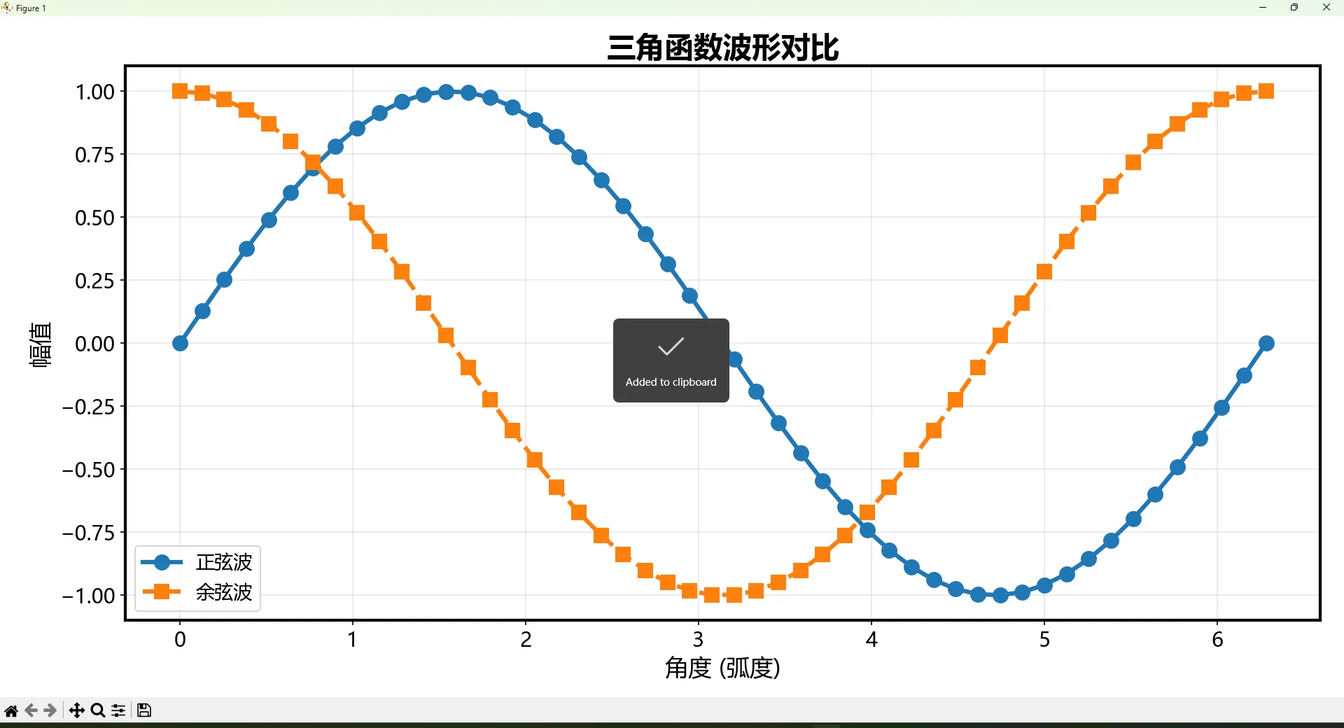
setup_presentation_style()
# 创建演示图表
x = np.linspace(0, 2*np.pi, 50)
plt.figure()
plt.plot(x, np.sin(x), 'o-', label='正弦波')
plt.plot(x, np.cos(x), 's--', label='余弦波')
plt.xlabel('角度 (弧度)')
plt.ylabel('幅值')
plt.title('三角函数波形对比')
plt.legend()
plt.grid(True, alpha=0.3)
plt.tight_layout()
plt.savefig('rcparams_demo.png')
plt.show()
⚠️ 踩坑预警
-
全局污染:直接修改
rcParams会影响后续所有图表!Jupyter Notebook里尤其要注意。建议用rc_context或者每次绘图前调用配置函数。 -
参数名拼写:
rcParams的键名记不住很正常,用mpl.rcParams.keys()查看,或者直接搜官方文档。 -
类型敏感:有的参数要数字,有的要字符串,有的要列表。搞错类型会报莫名其妙的错。
🀄 方案四:中文字体终极解决方案
这个问题困扰了太多人。我见过的"解决方案"没有一百也有八十种。今天给你一个在Windows下100%有效的方案。
完整可运行代码
pythonimport matplotlib
import matplotlib.pyplot as plt
import matplotlib as mpl
import numpy as np
import matplotlib.font_manager as fm
import os
matplotlib.use('TkAgg')
# ========== 诊断当前字体状态 ==========def diagnose_fonts():
"""诊断系统字体配置"""
print("=" * 50)
print("🔍 字体诊断报告")
print("=" * 50)
# 当前字体设置
print(f"\n当前font.family: {plt.rcParams['font.family']}")
print(f"当前font.sans-serif: {plt.rcParams['font.sans-serif'][:5]}...")
# 检查中文字体是否可用
chinese_fonts = ['Microsoft YaHei', 'SimHei', 'SimSun', 'KaiTi', 'FangSong']
available_chinese = []
system_fonts = [f.name for f in fm.fontManager.ttflist]
for font in chinese_fonts:
if font in system_fonts:
available_chinese.append(font)
print(f"✅ {font}: 可用")
else:
print(f"❌ {font}: 未找到")
print(f"\n系统共有 {len(system_fonts)} 个字体")
print(f"可用中文字体: {available_chinese}")
return available_chinese
available = diagnose_fonts()
# ========== 方案A:推荐配置(简单有效)==========
def setup_chinese_font_simple():
"""简单有效的中文字体配置"""
plt.rcParams['font.sans-serif'] = ['Microsoft YaHei', 'SimHei', 'DejaVu Sans']
plt.rcParams['axes.unicode_minus'] = False # 关键!解决负号显示问题
print("✅ 中文字体配置完成(简单方案)")
# ========== 方案B:完整配置(更可靠)==========
def setup_chinese_font_robust():
"""健壮的中文字体配置"""
# 清除字体缓存(解决缓存导致的问题)
cache_dir = mpl.get_cachedir()
cache_file = os.path.join(cache_dir, 'fontlist-v330.json')
if os.path.exists(cache_file):
print(f"发现字体缓存: {cache_file}")
# 刷新字体管理器
fm.fontManager.addfont
# 配置字体
plt.rcParams.update({
'font.family': 'sans-serif',
'font.sans-serif': ['Microsoft YaHei', 'SimHei', 'WenQuanYi Micro Hei', 'DejaVu Sans'],
'font.size': 12,
'axes.unicode_minus': False, # 用ASCII减号替代Unicode减号
})
print("✅ 中文字体配置完成(健壮方案)")
# ========== 方案C:指定字体文件路径(终极方案)==========
def setup_chinese_font_by_path():
"""通过字体文件路径配置(最可靠)"""
# Windows系统字体路径
font_paths = [
'C:/Windows/Fonts/msyh.ttc', # 微软雅黑
'C:/Windows/Fonts/simhei.ttf', # 黑体
'C:/Windows/Fonts/simsun.ttc', # 宋体
]
for path in font_paths:
if os.path.exists(path):
# 添加字体
fm.fontManager.addfont(path)
font_prop = fm.FontProperties(fname=path)
font_name = font_prop.get_name()
print(f"✅ 已添加字体: {font_name} ({path})")
# 设为默认
plt.rcParams['font.sans-serif'].insert(0, font_name)
break
plt.rcParams['axes.unicode_minus'] = False
print("✅ 中文字体配置完成(路径方案)")
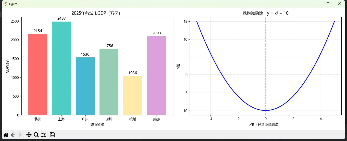
# ========== 执行配置并测试 ==========setup_chinese_font_simple()
# 测试图表
fig, axes = plt.subplots(1, 2, figsize=(14, 5))
# 左图:包含各种中文
x = ['北京', '上海', '广州', '深圳', '杭州', '成都']
y = [2154, 2487, 1530, 1756, 1036, 2093]
axes[0].bar(x, y, color=['#FF6B6B', '#4ECDC4', '#45B7D1', '#96CEB4', '#FFEAA7', '#DDA0DD'])
axes[0].set_title('2025年各城市GDP(万亿)')
axes[0].set_xlabel('城市名称')
axes[0].set_ylabel('GDP数值')
# 添加数值标签
for i, (xi, yi) in enumerate(zip(x, y)):
axes[0].text(i, yi + 50, f'{yi}', ha='center', fontsize=11)
# 右图:包含负数(测试负号显示)
x2 = np.linspace(-5, 5, 100)
y2 = x2 ** 2 - 10
axes[1].plot(x2, y2, 'b-', linewidth=2)
axes[1].axhline(y=0, color='gray', linestyle='--', alpha=0.5)
axes[1].axvline(x=0, color='gray', linestyle='--', alpha=0.5)
axes[1].set_title('抛物线函数:y = x² − 10')
axes[1].set_xlabel('x轴(包含负数测试)')
axes[1].set_ylabel('y轴')
axes[1].grid(True, alpha=0.3)
plt.tight_layout()
plt.savefig('chinese_font_test.png', dpi=150)
plt.show()
print("\n如果图表中文显示正常,配置成功!")
print("如果还是方框,尝试运行 setup_chinese_font_by_path()")
⚠️ 踩坑预警
-
axes.unicode_minus = False这行不能忘! 否则负号会显示成方框。这是中文字体配置里最容易漏掉的一个。 -
字体缓存:改了配置不生效?删掉
~/.matplotlib/下的缓存文件,重启Python。 -
字体名称vs文件名:
SimHei是字体名,simhei.ttf是文件名,别搞混了。用fm.FontProperties(fname=path).get_name()可以查字体真名。 -
Jupyter Notebook特殊问题:内核重启后配置丢失。建议把配置代码放在notebook最开头,每次运行。
📦 可复用代码模板
把这段代码保存成plot_config.py,以后每个项目直接import就完事:
python"""
plot_config.py - Matplotlib通用配置模块
作者: rick9981
日期: 2026-02-02
"""

import matplotlib.pyplot as plt
import matplotlib as mpl
import matplotlib.font_manager as fm
import warnings

def setup_chinese():
    """配置中文字体(Windows)"""
    plt.rcParams['font.sans-serif'] = ['Microsoft YaHei', 'SimHei']
    plt.rcParams['axes.unicode_minus'] = False

def setup_style(style='professional'):
    """
    快速设置图表样式

    Parameters:
    -----------
    style : str
        'professional' - 专业商务风格
        'academic' - 学术论文风格
        'dark' - 深色背景风格
        'minimal' - 极简风格
    """
    styles = {
        'professional': {
            'figure.figsize': [12, 7],
            'font.size': 12,
            'axes.grid': True,
            'grid.alpha': 0.3,
            'lines.linewidth': 2.5,
        },
        'academic': {
            'figure.figsize': [8, 6],
            'figure.dpi': 300,
            'font.size': 10,
            'lines.linewidth': 1.5,
            'axes.grid': False,
        },
        'dark': {
            'figure.facecolor': '#1a1a2e',
            'axes.facecolor': '#16213e',
            'axes.edgecolor': '#e94560',
            'text.color': '#eaeaea',
            'axes.labelcolor': '#eaeaea',
            'xtick.color': '#eaeaea',
            'ytick.color': '#eaeaea',
        },
        'minimal': {
            'axes.spines.top': False,
            'axes.spines.right': False,
            'axes.grid': False,
            'lines.linewidth': 2,
        }
    }

    if style in styles:
        plt.rcParams.update(styles[style])
        print(f"✅ 已应用 {style} 样式")
    else:
        print(f"❌ 未知样式: {style}")

def init_plot(chinese=True, style='professional'):
    """一键初始化绑图配置"""
    if chinese:
        setup_chinese()
    setup_style(style)
    warnings.filterwarnings('ignore', category=UserWarning)
    print("🎨 绑图环境初始化完成")

# 使用方法:
# from plot_config import init_plot
# init_plot(chinese=True, style='professional')
🎯 三点核心总结
-
样式切换用
plt.style.context():临时生效,不污染全局,这是最干净的做法 -
团队协作用
.mplstyle文件:一次配置,处处可用,新人秒上手 -
中文字体记住两行代码:
font.sans-serif设字体列表,axes.unicode_minus设False
🛤️ 学习路线图
想继续深入?按这个顺序来:
当前位置 → Matplotlib样式与主题 ✅
    ↓
下一站 → Seaborn高级可视化(更高层封装)
    ↓
进阶站 → Plotly交互式图表(Web展示神器)
    ↓
终极站 → 数据可视化设计原则(审美提升)
💬 聊聊你的经历
几个问题想听听大家的想法:
- 你们团队有统一的图表样式规范吗?怎么执行的?
- 除了Matplotlib,你还用什么可视化工具?各有啥优缺点?
- 遇到过最奇葩的字体显示bug是啥?怎么解决的?
评论区聊起来!
🏷️ 技术标签:#Python可视化 #Matplotlib技巧 #数据分析 #图表美化 #中文字体
📌 收藏理由:下次写报告、做PPT、发论文需要画图时,直接翻出来抄代码,省时省力省头发。
↗️ 转发一下:你的数据分析朋友可能正在为图表丑陋发愁——帮他一把呗?
本文作者:技术老小子
本文链接:
版权声明:本博客所有文章除特别声明外,均采用 BY-NC-SA 许可协议。转载请注明出处!