
目录
🎯 你是不是也遇到过这些问题?
在用 WPF 做数据可视化的项目里,图表的图例(Legend)和工具提示(Tooltip)往往是最容易被"将就"的地方。默认样式凑合能用,但一旦需求变成"图例要跟品牌色一致"、"Tooltip 要显示百分比和单位",很多开发者就开始抓头——LiveCharts 2 的文档散落各处,API 又和 LiveCharts 1 有大幅变化,踩坑是家常便饭。
我在一个工业数据监控项目里,就因为 Tooltip 格式问题排查了整整一个下午。后来系统整理了一遍 LiveCharts 2(基于 SkiaSharp 渲染)的定制体系,才发现它其实相当灵活——只要搞清楚三个层次:样式定制、格式化函数、完全自定义控件,绝大多数需求都能覆盖。
读完这篇文章,你将掌握:
- 快速调整 Legend/Tooltip 的颜色、字体、位置
- 精准控制 Tooltip 显示内容(格式化函数、堆叠数据、自定义字段)
- 从零构建 完全自定义的 Legend 和 Tooltip 控件
测试环境:.NET 8 + WPF + LiveChartsCore.SkiaSharpView.WPF 2.0.0-rc6.1,Windows 11
🔍 问题深度剖析:为什么默认配置"够用但不够好"
LiveCharts 2 相比第一代做了彻底重构,底层渲染从 WPF 原生控件改成了 SkiaSharp。这带来了跨平台能力和更高的渲染性能,但也意味着 Legend 和 Tooltip 不再是普通的 WPF UserControl,而是 SkiaSharp 绘制的"伪控件"。
这是很多人踩坑的根本原因:你不能直接用 WPF 的 DataTemplate 去套,也不能随便绑 Style。它有自己的一套 Visual API,理解这一点是一切定制的前提。
默认状态下,Legend 会显示在图表右侧,Tooltip 会在鼠标悬停时弹出数据点信息。这些"够用",但在实际项目里,你大概率会遇到:
- 图例颜色与 UI 主题不匹配
- Tooltip 显示的数值没有单位、没有格式(比如显示
1234567而不是1,234,567 元) - 需要在 Tooltip 里显示自定义字段(比如设备 ID、报警等级)
- 图例需要支持点击切换系列可见性
这些需求对应的解决方案,就是下面的三个递进方案。
💡 核心要点提炼
在深入代码之前,先把几个关键 API 概念捋清楚,后面看代码会顺畅很多。
Legend 相关属性(挂在 CartesianChart 上):
| 属性 | 类型 | 说明 |
|---|---|---|
LegendPosition | LegendPosition 枚举 | Top/Bottom/Left/Right/Hidden |
LegendTextPaint | IPaint<SkiaSharpDrawingContext> | 图例文字画笔 |
LegendBackgroundPaint | IPaint<SkiaSharpDrawingContext> | 图例背景画笔 |
Legend | IChartLegend | 完全自定义图例控件入口 |
Tooltip 相关属性:
| 属性 | 类型 | 说明 |
|---|---|---|
TooltipPosition | TooltipPosition 枚举 | 弹出方向 |
TooltipTextPaint | IPaint | 文字画笔 |
TooltipBackgroundPaint | IPaint | 背景画笔 |
YToolTipLabelFormatter | Func<ChartPoint, string> | Y 轴数据格式化 |
XToolTipLabelFormatter | Func<ChartPoint, string> | X 轴数据格式化 |
Tooltip | IChartTooltip | 完全自定义 Tooltip 入口 |
记住一个核心原则:所有"画笔"类型都来自 SolidColorPaint,颜色用 SKColor,而不是 WPF 的 Brush。这是 SkiaSharp 体系的规则。
🛠️ 方案一:快速样式调整(5分钟搞定)
这是成本最低的方式,适合只需要调整颜色、字体、位置的场景。全部在 ViewModel 里配置,XAML 绑定即可。
ViewModel 配置
csharpusing LiveChartsCore;
using LiveChartsCore.SkiaSharpView;
using LiveChartsCore.SkiaSharpView.Painting;
using SkiaSharp;
using System.Collections.Generic;

namespace AppLiveChart11
{
    public class ChartViewModel
    {
        // 折线系列示例数据
        public ISeries[] Series { get; set; } =
        {
            new LineSeries<double>
            {
                Name = "销售额",
                Values = new List<double> { 120, 250, 180, 390, 310, 470, 520 },
                Fill = new SolidColorPaint(new SKColor(33, 150, 243, 60)),
                Stroke = new SolidColorPaint(new SKColor(33, 150, 243)) { StrokeThickness = 2 },
                GeometrySize = 8,
                GeometryStroke = new SolidColorPaint(new SKColor(33, 150, 243)) { StrokeThickness = 2 },
                GeometryFill = new SolidColorPaint(SKColors.White),
            },
            new LineSeries<double>
            {
                Name = "利润",
                Values = new List<double> { 50, 90, 70, 160, 130, 200, 240 },
                Fill = new SolidColorPaint(new SKColor(76, 175, 80, 60)),
                Stroke = new SolidColorPaint(new SKColor(76, 175, 80)) { StrokeThickness = 2 },
                GeometrySize = 8,
                GeometryStroke = new SolidColorPaint(new SKColor(76, 175, 80)) { StrokeThickness = 2 },
                GeometryFill = new SolidColorPaint(SKColors.White),
            },
            new ColumnSeries<double>
            {
                Name = "成本",
                Values = new List<double> { 70, 160, 110, 230, 180, 270, 280 },
                Fill = new SolidColorPaint(new SKColor(255, 152, 0, 180)),
            }
        };

        // X 轴配置
        public Axis[] XAxes { get; set; } =
        {
            new Axis
            {
                Name = "月份",
                Labels = new[] { "1月", "2月", "3月", "4月", "5月", "6月", "7月" },
                NamePaint = new SolidColorPaint(new SKColor(80, 80, 80)),
                LabelsPaint = new SolidColorPaint(new SKColor(80, 80, 80)),
                NameTextSize = 14,
                TextSize = 12,
            }
        };

        // Y 轴配置
        public Axis[] YAxes { get; set; } =
        {
            new Axis
            {
                Name = "金额(万元)",
                NamePaint = new SolidColorPaint(new SKColor(80, 80, 80)),
                LabelsPaint = new SolidColorPaint(new SKColor(80, 80, 80)),
                NameTextSize = 14,
                TextSize = 12,
                MinLimit = 0,
            }
        };

        // 图例文字画笔:深灰色 + 微软雅黑(支持中文)
        public SolidColorPaint LegendTextPaint { get; set; } =
            new SolidColorPaint
            {
                Color = new SKColor(50, 50, 50),
                SKTypeface = SKTypeface.FromFamilyName("Microsoft YaHei")
            };

        // 图例背景画笔:浅灰背景
        public SolidColorPaint LegendBackgroundPaint { get; set; } =
            new SolidColorPaint(new SKColor(240, 240, 240));

        // Tooltip 文字画笔
        public SolidColorPaint TooltipTextPaint { get; set; } =
            new SolidColorPaint
            {
                Color = new SKColor(242, 244, 255),
                SKTypeface = SKTypeface.FromFamilyName("Microsoft YaHei")
            };

        // Tooltip 背景画笔
        public SolidColorPaint TooltipBackgroundPaint { get; set; } =
            new SolidColorPaint(new SKColor(0x48, 0x00, 0x32));
    }
}
XAML 绑定
xml<lvc:CartesianChart
    Series="{Binding Series}"
    LegendPosition="Bottom"
    LegendTextPaint="{Binding LegendTextPaint}"
    LegendBackgroundPaint="{Binding LegendBackgroundPaint}"
    TooltipPosition="Left"
    TooltipBackgroundPaint="#480032"
    TooltipTextPaint="#F2F4FF"
    TooltipTextSize="16">
</lvc:CartesianChart>
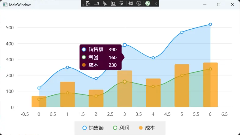
注意事项: TooltipBackgroundPaint 和 TooltipTextPaint 在 XAML 里可以直接写十六进制颜色字符串,LiveCharts 2 内置了类型转换器,非常方便。但如果你需要设置透明度,就必须用 ViewModel 里的 SolidColorPaint,XAML 的字符串方式不支持 alpha 通道。
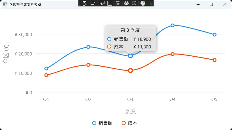
🎨 方案二:Tooltip 内容格式化(精准控制显示文本)
这是实际项目里最常用的场景——数值要带单位、要格式化、要显示自定义字段。LiveCharts 2 提供了 YToolTipLabelFormatter 这个 Lambda 函数,灵活度非常高。
基础数值格式化
csharppublic class SalesViewModel
{
    // 折线系列数据
    public ISeries[] Series { get; set; } =
    [
        new LineSeries<double>
        {
            Name = "销售额",
            Values = [12340, 23450, 18900, 34560, 29800],
            Fill = null,
            GeometrySize = 10,
            // Y 轴 Tooltip:货币格式,带千分位
            YToolTipLabelFormatter = point => $"¥ {point.Model:N0}",
            // X 轴 Tooltip:显示第几季度
            XToolTipLabelFormatter = point => $"第 {point.Index + 1} 季度",
            // 折线颜色
            Stroke = new SolidColorPaint(SKColors.DodgerBlue, 3),
            GeometryStroke = new SolidColorPaint(SKColors.DodgerBlue, 3),
            GeometryFill = new SolidColorPaint(SKColors.White),
        },
        new LineSeries<double>
        {
            Name = "成本",
            Values = [8900, 14200, 11300, 19800, 16700],
            Fill = null,
            GeometrySize = 10,
            YToolTipLabelFormatter = point => $"¥ {point.Model:N0}",
            XToolTipLabelFormatter = point => $"第 {point.Index + 1} 季度",
            // 折线颜色
            Stroke = new SolidColorPaint(SKColors.OrangeRed, 3),
            GeometryStroke = new SolidColorPaint(SKColors.OrangeRed, 3),
            GeometryFill = new SolidColorPaint(SKColors.White),
        }
    ];

    // X 轴:显示季度标签
    public Axis[] XAxes { get; set; } =
    [
        new Axis
        {
            Name = "季度",
            Labels = ["Q1", "Q2", "Q3", "Q4", "Q5"],
            NamePaint = new SolidColorPaint(SKColors.Gray),
            LabelsPaint = new SolidColorPaint(SKColors.Gray),
        }
    ];

    // Y 轴:显示货币格式
    public Axis[] YAxes { get; set; } =
    [
        new Axis
        {
            Name = "金额 (¥)",
            // 将 Y 轴刻度值格式化为带千分位的货币
            Labeler = value => $"¥ {value:N0}",
            NamePaint = new SolidColorPaint(SKColors.Gray),
            LabelsPaint = new SolidColorPaint(SKColors.Gray),
            MinLimit = 0,
        }
    ];
}
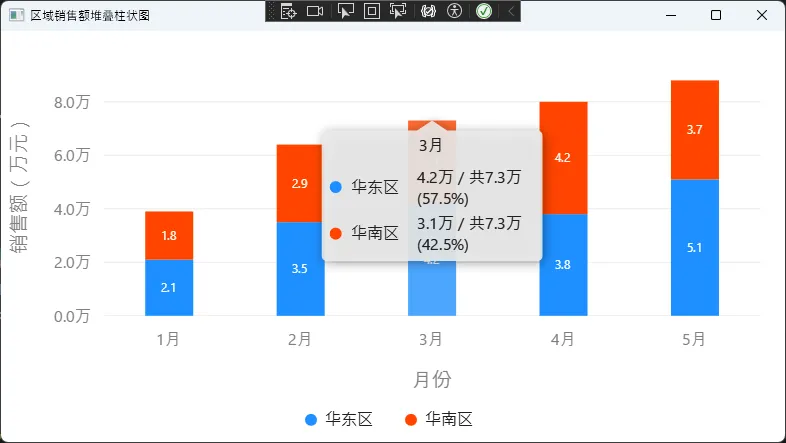
堆叠图表的百分比显示
在做堆叠柱状图时,经常需要同时显示"当前值 / 总量(占比)",StackedValue 属性是关键:
csharppublic class RegionSalesViewModel
{
    // 堆叠柱状图系列
    public ISeries[] StackedSeries { get; set; } =
    [
        new StackedColumnSeries<double>
        {
            Name = "华东区",
            Values = [2.1, 3.5, 4.2, 3.8, 5.1],
            // Tooltip:本区数值 / 总计 (占比)
            YToolTipLabelFormatter = point =>
                $"{point.Model:N1}万 / 共{point.StackedValue!.Total:N1}万 " +
                $"({point.StackedValue.Share:P1})",
            // 柱体填充色
            Fill = new SolidColorPaint(SKColors.DodgerBlue),
            Stroke = null,
            // 柱体顶部数据标签
            DataLabelsPaint = new SolidColorPaint(SKColors.White),
            DataLabelsSize = 12,
            DataLabelsPosition = LiveChartsCore.Measure.DataLabelsPosition.Middle,
            DataLabelsFormatter = point => $"{point.Model:N1}",
        },
        new StackedColumnSeries<double>
        {
            Name = "华南区",
            Values = [1.8, 2.9, 3.1, 4.2, 3.7],
            YToolTipLabelFormatter = point =>
                $"{point.Model:N1}万 / 共{point.StackedValue!.Total:N1}万 " +
                $"({point.StackedValue.Share:P1})",
            Fill = new SolidColorPaint(SKColors.OrangeRed),
            Stroke = null,
            DataLabelsPaint = new SolidColorPaint(SKColors.White),
            DataLabelsSize = 12,
            DataLabelsPosition = LiveChartsCore.Measure.DataLabelsPosition.Middle,
            DataLabelsFormatter = point => $"{point.Model:N1}",
        }
    ];

    // X 轴:月份标签
    public Axis[] XAxes { get; set; } =
    [
        new Axis
        {
            Name = "月份",
            Labels = ["1月", "2月", "3月", "4月", "5月"],
            NamePaint = new SolidColorPaint(SKColors.Gray),
            LabelsPaint = new SolidColorPaint(SKColors.Gray),
        }
    ];

    // Y 轴:万元单位格式化
    public Axis[] YAxes { get; set; } =
    [
        new Axis
        {
            Name = "销售额(万元)",
            Labeler = value => $"{value:N1}万",
            NamePaint = new SolidColorPaint(SKColors.Gray),
            LabelsPaint = new SolidColorPaint(SKColors.Gray),
            MinLimit = 0,
        }
    ];
}
自定义数据模型的字段显示
这是最实用的场景——数据点不是简单的 double,而是业务对象:
csharppublic class SensorViewModel
{
    private static readonly SensorReading[] TemperatureData =
    [
        new() { Value = 23.5, DeviceId = "T-001", AlarmLevel = "正常" },
        new() { Value = 67.2, DeviceId = "T-001", AlarmLevel = "警告" },
        new() { Value = 45.1, DeviceId = "T-001", AlarmLevel = "正常" },
        new() { Value = 78.4, DeviceId = "T-001", AlarmLevel = "危险" },
        new() { Value = 55.0, DeviceId = "T-001", AlarmLevel = "警告" },
        new() { Value = 31.2, DeviceId = "T-001", AlarmLevel = "正常" },
        new() { Value = 29.8, DeviceId = "T-001", AlarmLevel = "正常" },
    ];

    private static readonly SensorReading[] HumidityData =
    [
        new() { Value = 41.0, DeviceId = "H-002", AlarmLevel = "正常" },
        new() { Value = 38.5, DeviceId = "H-002", AlarmLevel = "正常" },
        new() { Value = 72.3, DeviceId = "H-002", AlarmLevel = "警告" },
        new() { Value = 85.6, DeviceId = "H-002", AlarmLevel = "危险" },
        new() { Value = 60.1, DeviceId = "H-002", AlarmLevel = "警告" },
        new() { Value = 45.9, DeviceId = "H-002", AlarmLevel = "正常" },
        new() { Value = 43.2, DeviceId = "H-002", AlarmLevel = "正常" },
    ];

    public ISeries[] SensorSeries { get; set; } =
    [
        new LineSeries<SensorReading>
        {
            Name   = "温度传感器 (°C)",
            Values = TemperatureData,

            Mapping = (reading, index) => new Coordinate(index, reading.Value),

            YToolTipLabelFormatter = point =>
            {
                var r = point.Model!;
                var icon = r.AlarmLevel switch
                {
                    "警告" => "⚠",
                    "危险" => "🔴",
                    _      => "✅"
                };
                return $"{icon} {r.Value:F1}°C  |  设备:{r.DeviceId}  |  {r.AlarmLevel}";
            },

            DataLabelsPaint     = new SolidColorPaint(SKColors.LightSkyBlue),
            DataLabelsSize      = 11,
            DataLabelsPosition  = DataLabelsPosition.Top,
            DataLabelsFormatter = point => $"{point.Model!.Value:F1}",

            Fill = new LinearGradientPaint(
                new SKColor(30, 144, 255, 80),
                new SKColor(30, 144, 255, 0),
                new SKPoint(0.5f, 0f),
                new SKPoint(0.5f, 1f)),
            Stroke         = new SolidColorPaint(SKColors.DodgerBlue, 2),
            GeometryStroke = new SolidColorPaint(SKColors.DodgerBlue, 2),
            GeometryFill   = new SolidColorPaint(SKColors.White),
            GeometrySize   = 10,
        },

        new LineSeries<SensorReading>
        {
            Name   = "湿度传感器 (%RH)",
            Values = HumidityData,

            Mapping = (reading, index) => new Coordinate(index, reading.Value),

            YToolTipLabelFormatter = point =>
            {
                var r = point.Model!;
                var icon = r.AlarmLevel switch
                {
                    "警告" => "⚠",
                    "危险" => "🔴",
                    _      => "✅"
                };
                return $"{icon} {r.Value:F1}%RH  |  设备:{r.DeviceId}  |  {r.AlarmLevel}";
            },

            DataLabelsPaint     = new SolidColorPaint(SKColors.LightSalmon),
            DataLabelsSize      = 11,
            DataLabelsPosition  = DataLabelsPosition.Top,
            DataLabelsFormatter = point => $"{point.Model!.Value:F1}",

            Fill = new LinearGradientPaint(
                new SKColor(255, 99, 71, 80),
                new SKColor(255, 99, 71, 0),
                new SKPoint(0.5f, 0f),
                new SKPoint(0.5f, 1f)),
            Stroke         = new SolidColorPaint(SKColors.Tomato, 2),
            GeometryStroke = new SolidColorPaint(SKColors.Tomato, 2),
            GeometryFill   = new SolidColorPaint(SKColors.White),
            GeometrySize   = 10,
        }
    ];

    public Axis[] XAxes { get; set; } =
    [
        new Axis
        {
            Name        = "采集时间",
            Labels      = ["08:00", "09:00", "10:00", "11:00", "12:00", "13:00", "14:00"],
            NamePaint   = new SolidColorPaint(SKColors.Gray),
            LabelsPaint = new SolidColorPaint(SKColors.Gray),
            SeparatorsPaint = new SolidColorPaint(SKColors.Gray)
            {
                StrokeThickness = 0.5f,
                PathEffect = new DashEffect([4, 4])
            },
        }
    ];

    public Axis[] YAxes { get; set; } =
    [
        new Axis
        {
            Name        = "传感器数值",
            Labeler     = value => $"{value:N1}",
            NamePaint   = new SolidColorPaint(SKColors.Gray),
            LabelsPaint = new SolidColorPaint(SKColors.Gray),
            MinLimit    = 0,
            MaxLimit    = 100,
            SeparatorsPaint = new SolidColorPaint(SKColors.Gray)
            {
                StrokeThickness = 0.5f,
                PathEffect = new DashEffect([4, 4])
            },
        }
    ];

    public RectangularSection[] Sections { get; set; } =
    [
        new RectangularSection
        {
            Yi     = 60,
            Yj     = 75,
            Fill   = new SolidColorPaint(new SKColor(255, 215, 0, 40)),
            Stroke = new SolidColorPaint(new SKColor(255, 215, 0, 120))
            {
                StrokeThickness = 1,
                PathEffect = new DashEffect([6, 3])
            },
            Label      = "警告区",
            LabelSize  = 11,
            LabelPaint = new SolidColorPaint(SKColors.Goldenrod),
        },
        new RectangularSection
        {
            Yi     = 75,
            Yj     = 100,
            Fill   = new SolidColorPaint(new SKColor(255, 50, 50, 35)),
            Stroke = new SolidColorPaint(new SKColor(255, 80, 80, 150))
            {
                StrokeThickness = 1,
                PathEffect = new DashEffect([6, 3])
            },
            Label      = "危险区",
            LabelSize  = 11,
            LabelPaint = new SolidColorPaint(SKColors.Tomato),
        }
    ];
}
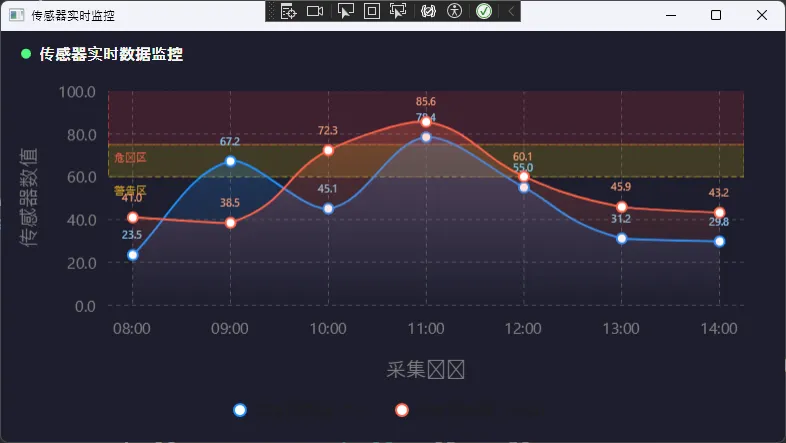
踩坑预警: 使用自定义模型时,必须同时设置 Mapping,否则 LiveCharts 不知道如何将你的对象映射到坐标系,图表会显示为空。这是新手最容易漏掉的一步。
🚀 方案三:完全自定义 Legend 和 Tooltip(从零构建)
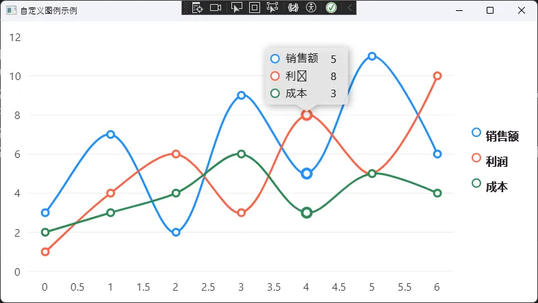
当业务需求超出了样式调整的范围,比如"图例要有复选框"、"Tooltip 要显示迷你图",就需要实现 IChartLegend 或继承 SKDefaultTooltip 了。
自定义图例(支持点击切换系列可见性)
这是一个完整的可运行示例,实现了带星形图标、点击可切换系列显隐的自定义图例:
csharpusing System.Linq;
using LiveChartsCore;
using LiveChartsCore.Drawing;
using LiveChartsCore.Kernel.Events;
using LiveChartsCore.Kernel.Sketches;
using LiveChartsCore.Measure;
using LiveChartsCore.SkiaSharpView;
using LiveChartsCore.SkiaSharpView.Drawing;
using LiveChartsCore.SkiaSharpView.Drawing.Geometries;
using LiveChartsCore.SkiaSharpView.Painting;
using LiveChartsCore.SkiaSharpView.VisualElements;
using LiveChartsCore.VisualElements;
using SkiaSharp;

public class CustomLegend : IChartLegend<SkiaSharpDrawingContext>
{
    private static readonly int s_zIndex = 10050;

    private readonly StackPanel<RoundedRectangleGeometry, SkiaSharpDrawingContext>
        _stackPanel = new();

    // 自定义字体画笔:微软雅黑加粗,支持中文
    private readonly SolidColorPaint _fontPaint =
        new(new SKColor(30, 20, 30))
        {
            SKTypeface = SKTypeface.FromFamilyName(
                "Microsoft YaHei", SKFontStyle.Bold),
            ZIndex = s_zIndex + 1
        };

    public void Draw(Chart<SkiaSharpDrawingContext> chart)
    {
        var legendPosition = chart.GetLegendPosition();
        _stackPanel.X = legendPosition.X;
        _stackPanel.Y = legendPosition.Y;
        chart.AddVisual(_stackPanel);

        // 隐藏模式下移除图例
        if (chart.LegendPosition == LegendPosition.Hidden)
            chart.RemoveVisual(_stackPanel);
    }

    public LvcSize Measure(Chart<SkiaSharpDrawingContext> chart)
    {
        _stackPanel.Orientation = ContainerOrientation.Vertical;
        _stackPanel.MaxWidth = double.MaxValue;
        _stackPanel.MaxHeight = chart.ControlSize.Height;

        // 清除旧元素,避免重复渲染
        foreach (var visual in _stackPanel.Children.ToArray())
        {
            _ = _stackPanel.Children.Remove(visual);
            chart.RemoveVisual(visual);
        }

        var theme = LiveCharts.DefaultSettings.GetTheme<SkiaSharpDrawingContext>();

        foreach (var series in chart.Series.Where(x => x.IsVisibleAtLegend))
        {
            var panel = new StackPanel<RoundedRectangleGeometry, SkiaSharpDrawingContext>
            {
                Padding = new Padding(12, 6),
                VerticalAlignment = Align.Middle,
                HorizontalAlignment = Align.Middle,
                Children =
                {
                    // 用星形图标替代默认方块
                    new SVGVisual
                    {
                        Path = SKPath.ParseSvgPathData(SVGPoints.Star),
                        Width = 20,
                        Height = 20,
                        ClippingMode = ClipMode.None, // 图例中必须设置!
                        Fill = new SolidColorPaint(
                            theme.GetSeriesColor(series).AsSKColor())
                        {
                            ZIndex = s_zIndex + 1
                        }
                    },
                    new LabelVisual
                    {
                        Text = series.Name ?? string.Empty,
                        Paint = _fontPaint,
                        TextSize = 14,
                        ClippingMode = ClipMode.None, // 图例中必须设置!
                        Padding = new Padding(6, 0, 0, 0),
                        VerticalAlignment = Align.Start,
                        HorizontalAlignment = Align.Start
                    }
                }
            };

            // 点击图例项切换系列可见性
            panel.PointerDown += GetToggleHandler(series);
            _stackPanel.Children.Add(panel);
        }

        return _stackPanel.Measure(chart);
    }

    private static VisualElementHandler<SkiaSharpDrawingContext>
        GetToggleHandler(IChartSeries<SkiaSharpDrawingContext> series)
    {
        return (visual, args) =>
        {
            series.IsVisible = !series.IsVisible;
        };
    }
}
在 XAML 中挂载自定义图例:
xml<lvc:CartesianChart Series="{Binding Series}">
    <lvc:CartesianChart.Legend>
        <local:CustomLegend />
    </lvc:CartesianChart.Legend>
</lvc:CartesianChart>
踩坑预警: ClippingMode = ClipMode.None 这一行绝对不能漏。图例元素默认会被裁剪,导致图标或文字显示不完整甚至消失。这个坑官方文档里特别标注了,但很容易被忽略。
自定义 Tooltip(继承 SKDefaultTooltip)
继承方式比从零实现 IChartTooltip 要简单得多,只需要重写 Initialize(设置样式和动画)和 GetLayout(定义内容布局)两个方法:
csharpusing LiveChartsCore;
using LiveChartsCore.Drawing;
using LiveChartsCore.Drawing.Layouts;
using LiveChartsCore.SkiaSharpView.Drawing;
using LiveChartsCore.SkiaSharpView.Drawing.Layouts;
using LiveChartsCore.SkiaSharpView.SKCharts;
using System.Linq;

namespace AppLiveChart11
{
    public class CustomLegend : SKDefaultLegend
    {
        protected override Layout<SkiaSharpDrawingContext> GetLayout(Chart chart)
        {
            var theme = chart.GetTheme();

            var stackLayout = new StackLayout
            {
                Orientation = ContainerOrientation.Vertical,
                Padding = new Padding(15, 4),
                HorizontalAlignment = Align.Start,
                VerticalAlignment = Align.Middle,
            };

            foreach (var series in chart.Series.Where(x => x.IsVisibleAtLegend))
                stackLayout.Children.Add(new LegendItem(series, theme.TooltipTextPaint));

            return stackLayout;
        }
    }
}
c#using LiveChartsCore;
using LiveChartsCore.Drawing;
using LiveChartsCore.Painting;
using LiveChartsCore.SkiaSharpView.Drawing;
using LiveChartsCore.SkiaSharpView.Drawing.Geometries;
using LiveChartsCore.SkiaSharpView.Drawing.Layouts;
using LiveChartsCore.SkiaSharpView.Painting;
using SkiaSharp;

namespace AppLiveChart11
{
    public class LegendItem : StackLayout
    {
        public LegendItem(ISeries series, Paint? textPaint)
        {
            Orientation = ContainerOrientation.Horizontal;
            Padding = new Padding(12, 6);
            VerticalAlignment = Align.Middle;
            HorizontalAlignment = Align.Middle;

            // 系列不可见时半透明显示
            Opacity = series.IsVisible ? 1 : 0.5f;

            // 获取系列自带的缩略图形(自动适配颜色)
            var miniature = (IDrawnElement<SkiaSharpDrawingContext>)series.GetMiniatureGeometry(null);
            if (miniature is BoundedDrawnGeometry bounded)
                bounded.Height = 24;

            Children =
            [
                miniature,
                new LabelGeometry
                {
                    Text = series.Name ?? "?",
                    TextSize = 16,
                    // 微软雅黑加粗,支持中文
                    Paint = new SolidColorPaint(new SKColor(30, 20, 30))
                    {
                        SKTypeface = SKTypeface.FromFamilyName(
                            "Microsoft YaHei", SKFontStyle.Bold)
                    },
                    Padding = new Padding(8, 2, 0, 2),
                    VerticalAlign = Align.Start,
                    HorizontalAlign = Align.Start
                }
            ];
        }
    }
}
在 XAML 中挂载:
xml<lvc:CartesianChart Series="{Binding Series}">
    <lvc:CartesianChart.Tooltip>
        <local:CustomTooltip />
    </lvc:CartesianChart.Tooltip>
</lvc:CartesianChart>
📊 三种方案对比
| 维度 | 方案一:样式调整 | 方案二:格式化函数 | 方案三:完全自定义 |
|---|---|---|---|
| 开发成本 | 低(10分钟) | 中(30分钟) | 高(2~4小时) |
| 灵活度 | 颜色/字体/位置 | 文本内容任意控制 | UI 布局完全自由 |
| 适用场景 | 快速换肤 | 业务数据格式化 | 品牌化、复杂交互 |
| 维护难度 | 极低 | 低 | 中等 |
🏁 总结
WPF LiveCharts 2 的图例和工具提示定制,本质上是在 SkiaSharp 的绘制体系里做 UI 布局,和传统 WPF 控件开发的思路有所不同,但一旦理解了这套 Visual API 的逻辑,定制起来其实相当流畅。
三个核心结论值得记住:
"先用格式化函数,80% 的 Tooltip 需求都能满足,不要动不动就从零写自定义控件。"
"
ClipMode.None是图例自定义的生命线,忘了它你会怀疑人生。"
"自定义数据模型时,
Mapping和YToolTipLabelFormatter必须配套使用,缺一不可。"
后续如果你的项目需要进一步深入,可以研究 FindPointsInPosition 的重写(控制 Tooltip 触发逻辑)以及 LiveCharts 2 的主题系统(LiveCharts.Configure),这两块能让图表体验再上一个台阶。
💬 讨论话题: 你在项目里遇到过哪些 LiveCharts 2 的"奇葩坑"?欢迎在评论区分享,说不定能帮到同样在踩坑的人。
#C#开发 #WPF #LiveCharts2 #数据可视化 #性能优化
相关信息
我用夸克网盘给你分享了「AppLiveChart11.zip」,点击链接或复制整段内容,打开「夸克APP」即可获取。
/9b6d3YPd3B:/
链接:https://pan.quark.cn/s/3659a523821c
提取码:NpNg
本文作者:技术老小子
本文链接:
版权声明:本博客所有文章除特别声明外,均采用 BY-NC-SA 许可协议。转载请注明出处!